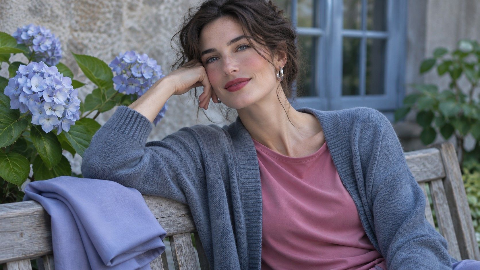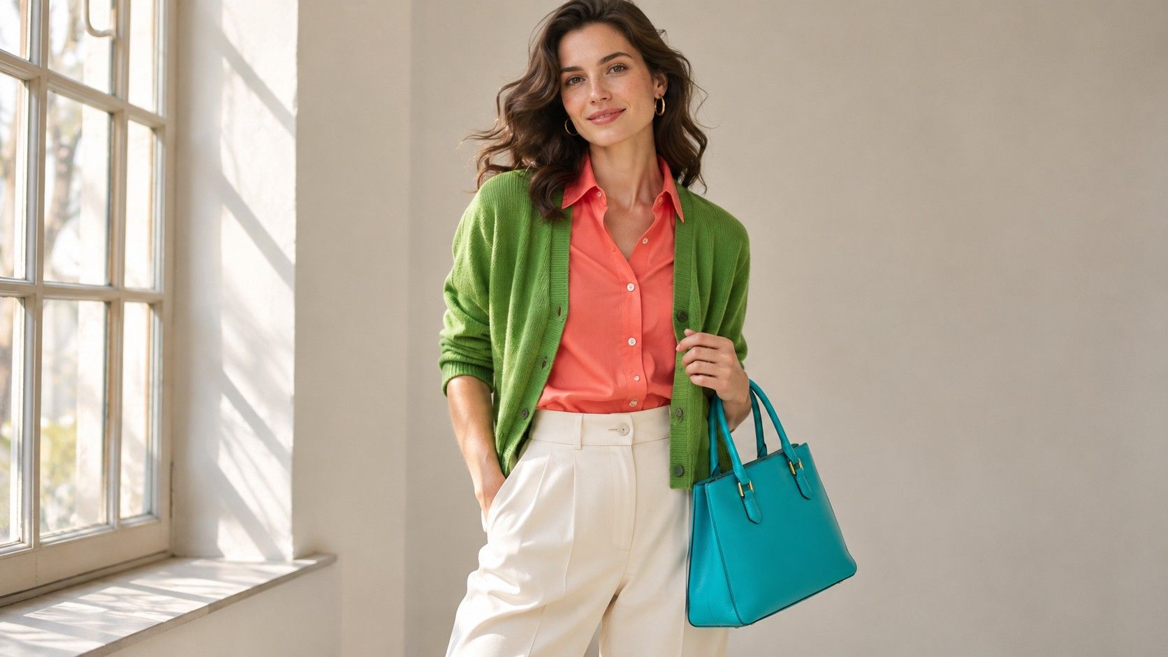
A Bright Spring color palette gives you a way to wear lively color without having to dress head to toe in brights. Think a clean coral shirt with dark blue jeans, a leaf-green button-down under a navy jacket, or a crisp ivory collar inside a clear turquoise sweater. Start by finding one vivid color that holds up in daylight, then test which neutrals make it useful with the clothes you already own.
Find the kind of brightness you can wear
Look for colors with edges you can describe before you reach for a season name. A strawberry red can feel clear and lively, while a faded brick red contains an earthy quality that changes how it reads next to your skin. Tangerine can work as a test color if you balance the depth and compare it with a muted orange of similar lightness. A deep rust and a pale peach are a difficult pair to learn from because temperature, depth and strength all shift at once.
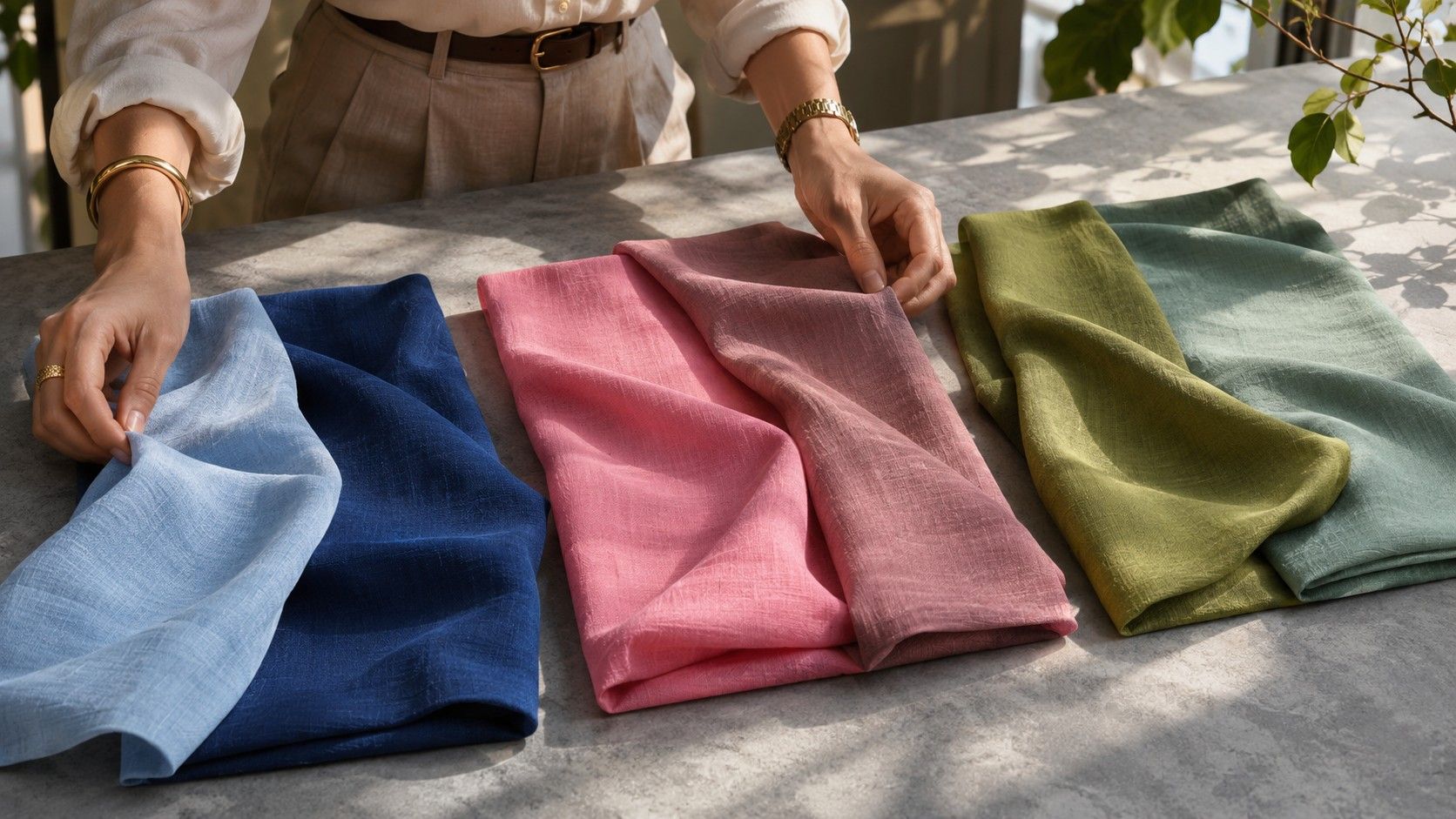
Try two shirts of the same fabric by a window. Cover the color already at your neckline with a plain cloth and hold each shirt at the same height. Compare the skin around your mouth and the shadows below your eyes, then look at whether your features stay easy to see when the fabric is next to them. Squinting or stepping back can help you notice where your attention goes before you start thinking about your favorite color. Repeat with a second color family before committing to a whole palette.
Some dyed fabrics look rich indoors and almost electric in direct sun. Compare in open shade or indirect window light so the surface of a glossy shirt does not overwhelm the shade itself. A saturated cotton poplin often gives a cleaner first comparison than a sequined or satin garment. Keep the material consistent when you can and do a separate try-on for texture later.
Compare Bright Spring with Bright Winter
Both palettes can handle clear pinks, greens and blues, so an intense first drape may give you two plausible directions. Once you find a useful level of clarity, try a warm-leaning red against a cool-leaning red. A clean tomato and a crisp raspberry make a better study pair when they have roughly the same depth. The useful question is whether the warmer fabric keeps your features in proportion or the cooler fabric gives them more definition.
Put a paper-white shirt and a clean warm ivory shirt beside each other. Both need to be fresh and reasonably bright. A grayish cream introduces softness that can confuse the comparison. If you like your face in the ivory, see whether that response repeats with a warm emerald or a bright aqua. If cool raspberry, blue-red and white keep winning, test Bright Winter separately. You can wear colors from both even when one palette offers a more reliable shopping baseline.
Try the winning shirts with a jacket if you usually wear layers. A collar that suits you alone may become too quiet behind a dark jacket, while a sweater that felt very loud on its own may look balanced with only a few centimeters visible. Write down how much color you wore as well as its name. This distinction helps when you decide whether to buy a coat, a scarf or a full dress in a strong shade.
Build a set of neutrals around one shirt
Choose a bright shirt you already wear and lay it next to three possible foundations. A clean navy can ground coral without making it read dusty, a warm ivory can keep a clear green looking fresh, and a medium caramel can support turquoise when the brown has warmth and enough definition. Test the exact pieces together. Two items sold as navy can differ enough that one looks like muted slate beside the same vivid top.
For work, try a navy trouser, warm white shell and a short coral cardigan. The cardigan repeats easily with denim and a dark skirt, which makes it a better test purchase than coral trousers you can only wear one way. For a less colorful variation, put the strong color in a necklace, glasses frame or slim scarf and leave the rest of the look in a clean neutral. Keep the color close enough to your face to assess its effect.
Change one piece before buying another shade. If a turquoise sweater seems disconnected from your wardrobe, try swapping a gray-blue jean for a cleaner indigo. Bring the neck of your own white tee under the sweater and see whether its edge makes the outfit feel more intentional. After you find combinations you can repeat, photograph them on a hanger so you can remember which shades actually work together.
Control the size and spacing of bright colors
Check how a print behaves from conversational distance. A fabric with little coral and green flowers may read as a single dull field once the motifs visually blend with a gray background. A larger print with a warm white ground and distinct color patches keeps the shape of each shade clearer. If a busy design competes with your face, wear it as a skirt or put it below a solid neckline. A printed scarf can also show a smaller section when folded.
Treat contrast as something you can adjust. A clear yellow against bright navy creates a stronger distinction than the same yellow against ivory. A high-contrast outfit can look tidy if you repeat a color in two places, such as a navy jacket with navy shoes and a chartreuse knit in between. For a gentler result, leave the jacket open over the knit and use a lighter trouser. You can keep the warmth and clarity while changing how loudly the whole outfit reads.
Keep a shopping swatch that matches real clothes
Choose three swatches from items you have worn several times. Include a neutral, a strong warm color and a second saturated color you can combine with your neutral. A necklace cord in clear coral can work as well as a fabric cutting when you are checking hue. Compare items near a window in the shop if possible. Use the swatch under the same light as the garment, because an indoor bulb can make two pieces look similar until you move outside.
If you are buying online, use the official product photos to identify a likely candidate and check the return terms before treating the pictured color as a match. Compare the item to your own swatches as soon as it arrives. Test it stretched over your shoulder and folded in two, since thin fabric may pick up color from a dark layer underneath. Keep the garment if it gives you a useful outfit and a clear result near your face. A color with the right seasonal label still needs to earn space in your closet.