A color palette test works best when you can tell which change produced the result. Comparing a vivid orange silk scarf with a pale blue cotton shirt changes temperature, depth, saturation and texture altogether. Match the fabrics more closely and run three separate comparisons. The result will give you a shortlist of colors to try again with clothes.
Clear the space before you take a reading
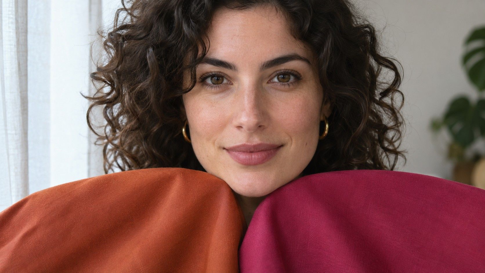
Choose a room with indirect daylight and a mirror that lets you sit or stand with your face toward the window. Turn off ceiling bulbs and move away from bright walls that bounce color toward you. Set out a plain sheet or large neutral tee to cover what you are already wearing. Hold each swatch at the same height against this background. If you can, remove tinted glasses and use your usual bare skin or set a time when your makeup looks the same for both tests.
Keep a note of whether the sky is overcast and where you stand in relation to the window. If the fabric changes appearance visibly when a cloud moves, wait until the light stabilizes. Place the swatches in a row within reach so that you can change fabrics without moving your feet or turning your head. Use a mirror for the main comparison. If you also take photos, keep the camera fixed and turn off face filters so you can preserve a useful visual record.
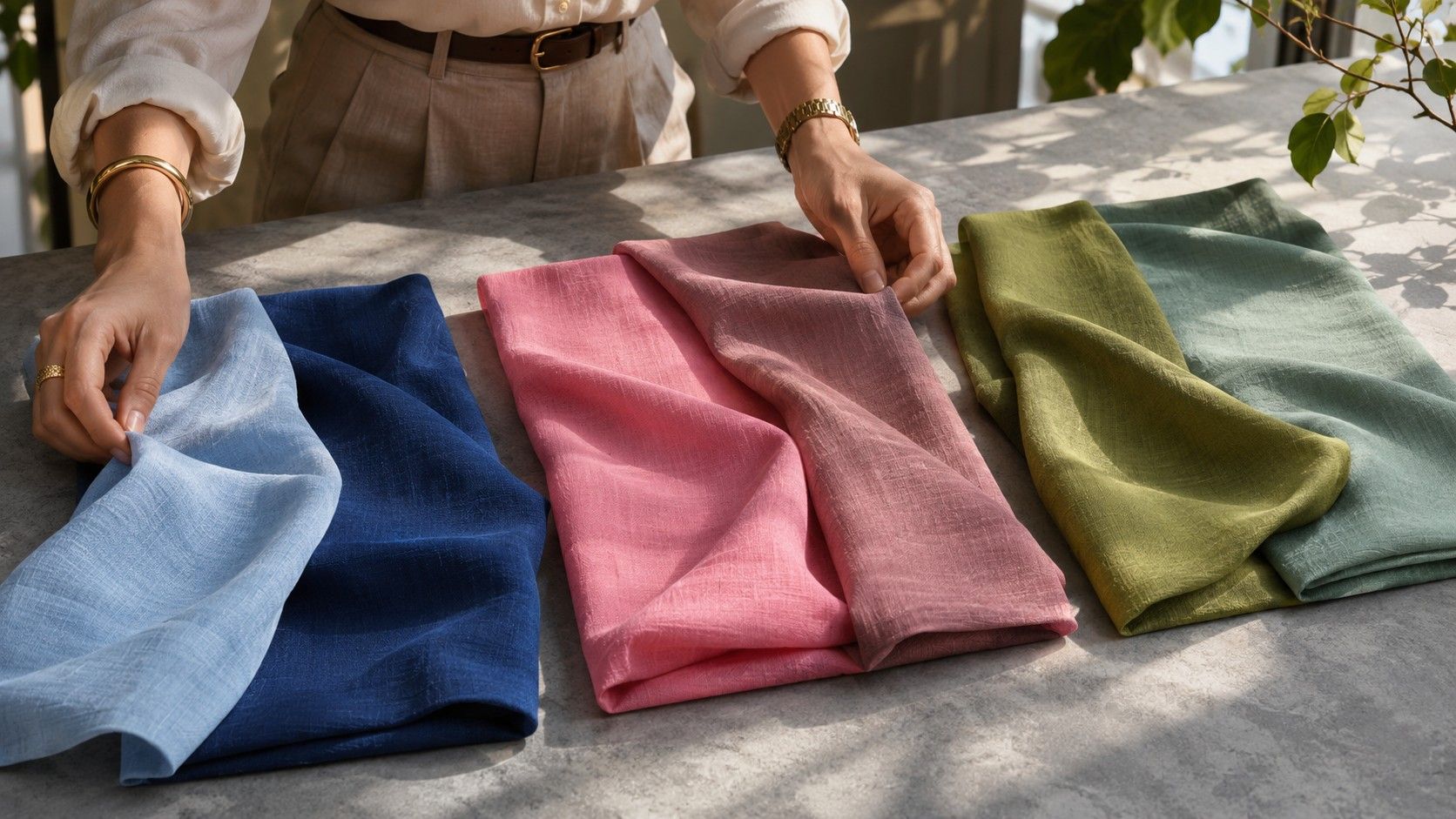
Fold garments into squares or rectangles with a similar width. A large pale drape reflects more light onto your face than a narrow strip of dark fabric. Leave enough surface visible for both swatches to reflect light. Make one fold where there are stripes, hardware or decorative stitching so your eye can settle on the cloth.
Compare warm and cool swatches of similar strength
For temperature, start with a pink family pair such as soft salmon and dusty rose. Try to match their lightness and grayness so that the warmer swatch is not also considerably brighter. Hold each for several seconds. Look at the face as a whole first, then at cheek and mouth edges. Record an observation you can test again, such as whether the shadows around the nose seem easier to see in one color.
If you have two suitable green swatches, compare an olive green with a cooler, bluer green of similar depth. One pink may be unusual enough in your closet that you have trouble getting past personal taste. A green pair changes the hue family and checks whether warmth still appears to make a similar difference. Run the second pair from the opposite starting swatch to reduce the effect of seeing one direction first.
Color temperature applies within families as well as across them. Some blues lean green and others lean violet. With this first comparison, aim for a broad warm-to-cool difference that survives a change of hue family. If the pinks point one way and the greens the other, move the less convincing pair farther down the list and use a better match another day.
Change the lightness and keep the hue steady
Use a lighter and darker swatch in the same general family. Think slate blue against ink blue or honey tan against deep caramel. A mid-value comparison can help if the palest and deepest options both feel too strong. Cover the warmer or cooler pieces before you begin. Looking back at the previous set can change what seems neutral.
Check where the face ends and the garment begins. A deep color can create definition at the neckline and echo strong depth in the brows or eyes. It can also create a larger dark area than you want right under the chin. A light fabric can reflect more light upward. Watch for a color that leaves the deeper facial features clear while avoiding the sensation of looking only at the outline of the top.
If the darkest cloth seems to suit you, run one more pair between a medium-dark and very dark shade. A preference for depth does not tell you how close to black a shirt has to be. A workable dark blue may be easier to combine with the rest of your clothes than the darkest navy you can find.
Work out how much clarity you want
Pick a clear swatch and a gray-softened version of the same hue with similar depth. A vivid red and muted red can work if both are medium-dark. A clear cool pink and a dusty cool pink may be easier for a lighter session. Compare the fabrics laid flat first. If one has a much larger light-to-dark difference before you put it on, choose a different pair so depth does not dominate the reading.
Use a bounded decision such as “I would wear A as a shirt and B as a small accent.” A very vivid fabric can pull attention to itself while still being welcome in a print or an accessory. A subdued fabric sometimes works under a jacket without creating enough distinction for an entire outfit. Record where you would actually wear the color before deciding it belongs in every category.
If texture gets in the way, repeat the comparison with two matte fabrics. A clear fabric with a shine can appear quite different when you turn your shoulders a few degrees, and dark velvet can create multiple depths across folds. Choose a flat light and hold each garment taut enough that you judge the dyed color and any normal surface effects together.
Repeat the closest calls and build a small test palette
Create a simple record giving each pair an observation, a preferred use and a confidence level. Compare two swatches that seem tied with one garment you know well. If both go with that garment and neither gives a clear improvement at the neckline, keep them open as options. A result with a narrow range on one axis and a flexible range on another will still help you choose outfits.
Select one neutral and one accent from your most reliable pairs. Test them in an ordinary outfit on two occasions before you look for a seasonal swatch chart. For example, a preference for cool, medium-deep and subdued fabric might suggest trying cool soft palettes first. A blue-gray and a muted berry can help you see how the observation works in clothing. Keep the working colors when you look at nearby palettes and test any new chart with a repeatable fabric comparison.