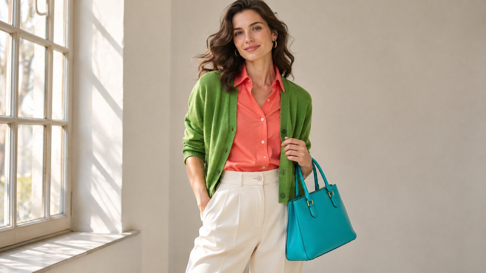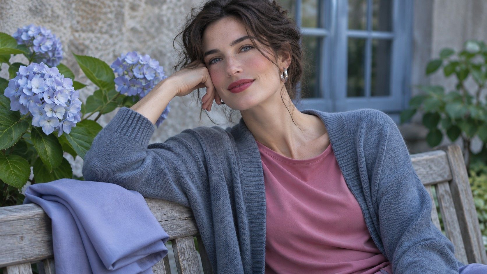
A Cool Summer color palette puts cool color first and uses a softened finish to keep clothes easy to combine. A raspberry blouse may still have substance, but it sits comfortably with a blue-gray jacket and silver hardware. If pale cool colors make you feel washed out and very strong cool colors dominate the outfit, begin in the middle and see which fabrics hold their own next to your face.
Establish a cool baseline with two fabric pairs
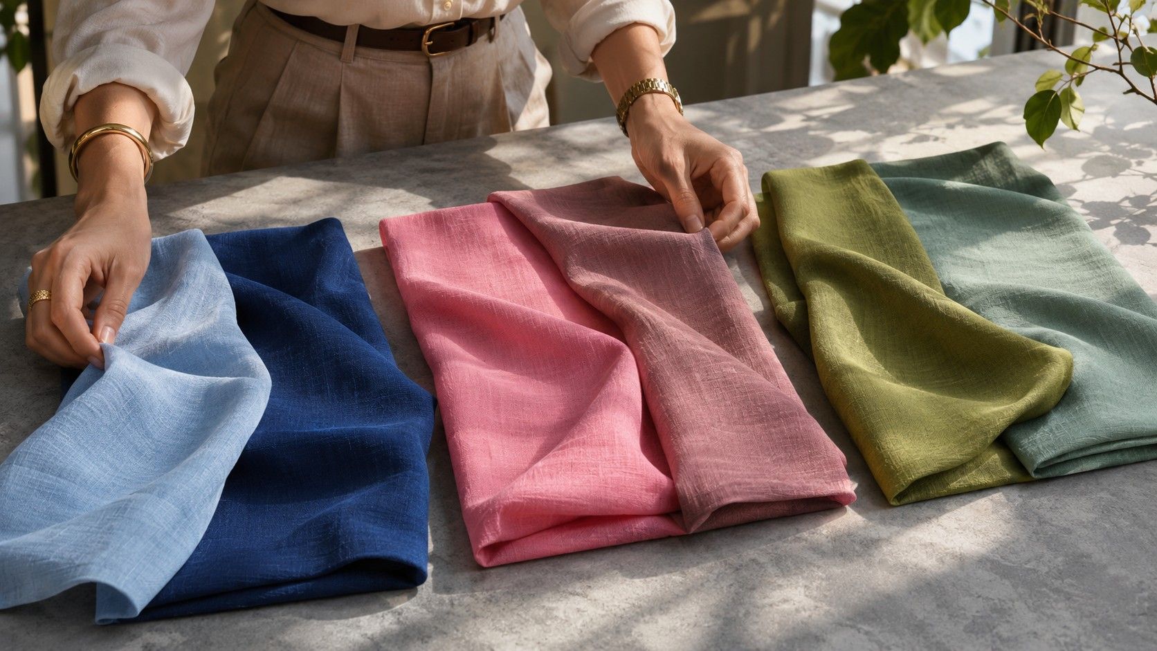
Bring a rosy pink and a peach pink into indirect daylight. Match their weight, texture and depth where you can. Lift each just below the chin and notice whether your mouth and the whites of your eyes stay clearly defined. Put both fabrics down between comparisons so you can reset your impression. Then repeat with a cool navy and a warm-leaning brown of comparable depth. A useful result is a pattern that survives a change of color family.
Use a cool rose with enough color to see what it is doing. A near-white pink may disappear because it is very light, even if the cool direction suits you. If the cool pink looks chalky, try a medium rose alongside a medium warm salmon before reconsidering the temperature result. Fabric sheen matters too. A bright streak on a satin blouse can draw attention before you have a chance to assess the color.
Cool Summer colors can look grayish next to candy pink and still read as recognizable pink or red on their own. A drape that looks pleasantly quiet in isolation but makes everything around your face seem dull may be too soft. Keep one blue, one rose and one berry in your comparison set. If each winning shade has a clear cool character and moderate strength, you have enough information to start dressing with the palette.
Place your contrast between Soft Summer and Cool Winter
Soft Summer and Cool Summer can overlap in dusty blue, mauve and soft navy. To distinguish those options, compare a more clearly blue rose with a grayer mauve and see whether a little more cool color brings definition. Then compare your favorite rose with a very crisp fuchsia. When the fuchsia makes the outfit feel sharp before you see your features, the mid-strength rose is a useful reference.
To check the difference against Cool Winter, try a black sweater and a blue charcoal sweater under the same white collar. Photograph them side by side in similar window light if you want a record, but make your first judgment in the mirror. Black and white can create such a strong jump that you see the border first. A blue charcoal paired with an almost-white cool gray brings back some detail and keeps the effect structured enough for tailoring.
If you suit a softer Summer neckline but prefer a stronger silhouette, move some contrast to the rest of the outfit. A slate coat over a rose knit can look composed while a darker shoe supplies a crisp edge lower down. A cool plum bag or burgundy belt can add depth without bringing a black stripe right across your neck. Check how the look reads from two steps away. The adjustment should preserve the shape of the outfit as well as the coloring near your face.
Use a navy and rose base for a short work wardrobe
Pick a navy with a blue cast you can see beside black. Add a slate-gray trouser and a rose shirt with a cool finish. Those three items yield a soft contrast with the navy blazer, a quieter one with the slate trouser and a sharper one if you add a very light blue-gray shell. Use matte buttons or softly polished metal when you want hardware that blends into the clothes.
For a dress that fits different occasions, a medium blueberry or cool plum is easier to layer than a pink that can feel conspicuous in formal settings. A plum dress with slate shoes and a cool gray coat works as a tonal outfit when the purple comes through strongly enough. If you usually reach for black shoes, try them with charcoal tights or darker blue-gray socks so the transition at the ankle feels deliberate.
Watch what happens when an accessory adds color near the face. A dusty blue cotton scarf can cool down the look of an otherwise warm oatmeal coat. A berry scarf can do the same job and make a clearer focal point. Choose the one that feels closer to your preferred amount of color while still leaving the coat wearable. If neither works, test the scarf with a neutral jacket before you decide the scarf is at fault.
Choose prints and makeup by the color you see first
A floral design may include plenty of slate and rose yet read as beige overall if the background takes up most of the cloth. Hold it up at arm's length and look away for a second, then check which color you register on the first glance. For a top, favor a blue-gray, softened navy or smoky purple foundation if the effect you want is cool. A warmer print can still be useful when a cool collar separates it from your skin.
For lip colors, try a rose close to your natural lip depth before moving into strong berry. Wipe the shade away and see whether the next one changes the appearance of your skin or simply changes the focus of the outfit. A sheer formula may look warmer on your lips than on white packaging. Compare it when applied as you plan to wear it, and in the same light you use for your wardrobe checks.
Grey and silver accessories can help you connect shades with different depths. Imagine a heather-blue sweater, a cool berry skirt and a worn silver watch. The grey element can repeat the softness of the blue without forcing the berry to match it exactly. A mirror-polished piece creates a harder reflection than brushed metal. Either can work, but the finish is worth checking when the rest of the outfit feels quiet.
Save color notes that you can use six months later
Choose two of your best drapes and note the color, depth and fabric. A short note such as cool mid-rose in matte cotton is easier to act on than a seasonal label alone. Photograph your gray and navy alongside each other for comparison. Under a warmer lamp they may seem to converge, while daylight reveals whether one contains violet, green or brown.
Before buying a new neutral, lay out two outfits you can make with that piece. Compare how the gray or blue looks with the cool rose you already wear and the shoes you expect to use. If it works under your usual lighting and against both colors, it has a clear role in your wardrobe. Keep using that piece as a swatch the next time you shop.