A Cool Winter color palette makes room for clean blues, berry colors and distinctly cool dark neutrals. It is an especially useful direction if you like a crisp outline around an outfit and find that warmer shades make the neckline feel heavy. Try two cool colors with different strengths first, then build a set of clothes where your preferred colors can show up at the scale you actually enjoy wearing.
Compare cool reds in daylight
A cool red can look different from a warm red even if both are sold under the same name. Place a clean berry or blue-red beside a tomato or orange-red of similar depth. Try each near the face in indirect daylight while wearing the same neutral base. Look for a clear outline around your lips and brows and notice whether the shadow below your chin becomes more pronounced. Keep track of which fabric helps you see your features easily when you step back.
Repeat the comparison with clean cobalt and a warm blue-green. A cool red alone is a limited clue, especially if red clothes tend to feel dramatic on you regardless of season. A second family helps you separate a temperature preference from your personal reaction to a certain color. Compare the fabrics away from direct sun, which can create harsh edges and make any saturated item seem more forceful.
For a white comparison, find a crisp white and a clearly creamy white. Let each occupy the same amount of space under your chin. A stiff shirt collar and a smooth knit will reflect light differently, so two cotton shirts are useful here. If white looks good in a thin line but feels stark with the whole front of a garment on view, note that scale. You may still find a white collar useful under a darker layer.
Separate Cool Winter from the brighter and deeper Winters
Start with the color you preferred in the first test. Compare it with a more intense version in about the same depth. A saturated cool raspberry beside clear fuchsia is one option. A true cobalt beside a very vivid electric blue is another. If you feel most at ease when the color is distinctly cool and only moderately intense, your strongest everyday Winter colors may be found in the Cool Winter range.
Next compare a clean berry with a deeper blackened cherry, then an ordinary cool navy with a navy so dark it looks almost black indoors. Deep Winter may suit someone who likes richness and depth before anything else. If the darker shades swallow details around your face, they may be easier as bottoms or a narrow outer layer. If all the richer colors look good, test a Deep Winter shade at the same time and place as a Cool Winter favorite.
You can also compare with a somewhat softened blue from Cool Summer. A clean blue makes it easier to judge whether your face benefits when the shade keeps its edge. If the softened blue wins even when the temperature and depth are close, contrast and clarity are worth another look. Treat the names as handles for groups of garments you can test.
Build a winter wardrobe that extends beyond black
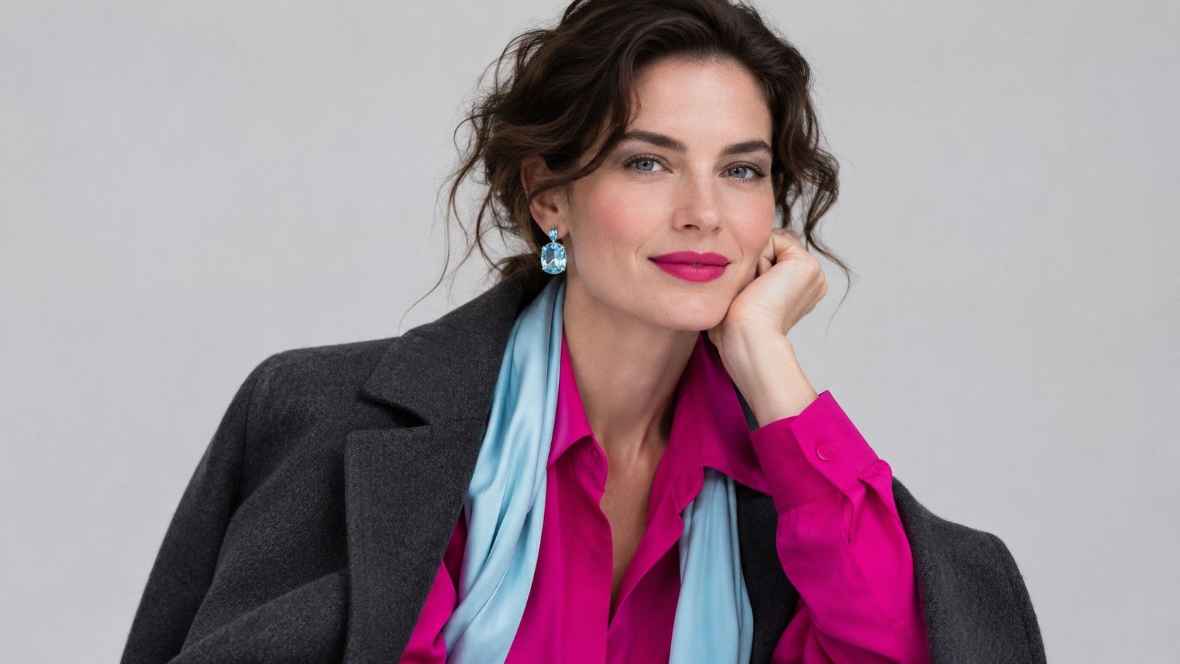
Choose a blue navy suit, charcoal trousers and a berry or cobalt top. Put a pale icy blue shirt into the same set and compare it with white. Icy blue can make a collar visibly cooler while keeping a clear line against the jacket. The white might suit an outfit with stronger contrast. Pick one for your first work outfit and use the other when you want to adjust how formal it feels.
Black is easy to repeat in shoes or trousers. If a solid black turtleneck feels too dark, a cobalt scarf, a white collar or a silver chain can give the neckline an interruption. Try the neck and cuffs in the same cool accent to make the color feel like part of the clothes. For a gentler version, switch the black turtleneck for cool charcoal without changing the rest of the outfit. The strongest pairings are often the ones you can adjust by changing a single piece.
A day-to-night option begins with straight navy trousers and a deep cool raspberry shirt. Add a charcoal cardigan for daytime. Change to a dark blazer and show a little more of the shirt front for evening. A steel-blue coat can go on top of the outfit if its color is clean enough to hold against the shirt. Check the transition at the hem and sleeves under indoor light where subdued reds can look nearly brown.
Choose pale accents and prints with clean outlines
An icy shade has a hint of color with a cool cast. Pale blue, frosted pink and very light lavender offer different options against deep navy. Try an icy blue scarf over a dark knit and fold it to change the visible width. A wider fold brightens more of the neckline. A narrow fold looks closer to a colored edge. Either can work with the right depth in the rest of the outfit.
For prints, look at the background first. A dark, cool foundation with recognizable white or blue shapes gives you separate areas of contrasting color. A close pattern that visually mixes into gray makes a quieter effect. Both can be worn, so decide where you want to place the color. A larger pattern may be a good scarf choice while a low-contrast pattern can stay useful in a coat or pair of trousers.
Check materials while you evaluate shades. A very glossy satin can produce a bright line next to your skin even if the base color has moderate contrast. Smooth wool sits somewhere else in the same look, and soft brushed wool can scatter the light enough to dull a clean hue. If a shirt works on a hanger but feels shiny on the shoulders, try blocking the shoulder area with a jacket and see whether the part you like remains visible.
Write down a dependable color reference
Start with a swatch from your best dark neutral, one color you like near your face and a light shade you can use for a collar. If you shop for another piece in a similar family, lay the swatches next to it under the same light. A bright raspberry and a brown burgundy can both be described as berry. You can tell them apart faster when you compare them with the top you already wear most often.
Try on the new color with a few things you already own before deciding it belongs in your base palette. A cool pink blouse with navy can make an easy outfit while a similar blouse next to charcoal feels more formal. Use a mirror from a few feet away to see whether the colors still have their own shape. Record the combination that worked with the shoe and layer you used. That note will be more specific than a photo of the fabric alone.