A deep autumn color palette can help with a common wardrobe decision. You want an alternative to another black coat, but camel feels too light for the way you dress. Espresso, bark, and a brown-based olive give outer layers their usual depth while picking up the warmer tones in scarves, shoes, and knits. Compare them at the neckline before committing to a staple.
Use a dark neutral with visible warmth
Take the darkest options you already have and lay them by a window. Keep one known black item in the group as a reference. Dark brown often becomes easier to see at the edge of a fold or seam than in the middle of the fabric. An olive-black twill may look greener when you pair it with espresso. Try that combination beside a deep warm gray to see which version carries the brown or green you wanted.
A jacket needs enough definition against the shirt under it. A very deep olive over espresso can work with a cream undershirt visible at the cuff or collar. Brown against cocoa often shows more clearly once one layer has a different finish. A smooth poplin under a coarse wool jacket adds a contour at the seam, so similar dark colors can still read separately from across the room.
Pick rich accents from three different color families
Build a useful range by trying one red, one green and one blue-green. A brown-cast garnet or red plum can give a softer edge than a sharp cherry red. Dark moss and forest green are easier to combine with brown if a little gold or olive shows in daylight. For blue-green, try a deep teal with enough green to sit comfortably against caramel.
Make each test with a dark garment and a lighter one. Dark teal over espresso feels very different as a top over trousers than it does as a tiny ribbon edge under a coat. Hold a large swatch or shirt by your face to see where your eye goes first, then test a smaller area to find a workable application. A bright accent can still earn a place as a small bag, narrow stripe or watch strap.
Leave at least one piece around the middle of the depth range. A chestnut belt, spiced brown vest, or warm gray-brown jacket can connect a cream shirt to the darkest trousers. If it feels like every item has become its own focal point, wear the middle shade as the bridge and keep one accent family. Save the other accent for an outfit built around the same base.
Build one outfit for work and one for a weekend
For a work outfit, start with espresso trousers and a medium warm olive top. Choose a neutral jacket with enough structure or depth to show its boundaries. A dark brown jacket works if the top is easily visible at the front. A warm patterned scarf can pick up olive and an accent of wine while allowing the trousers and shoes to share the same base. Check at a distance whether the top remains visible when you are seated.
For a weekend outfit, dark warm denim, a deep paprika or brick knit and dark brown boots give each color a different job. Add a faded tan tee under the knit so it comes through at the collar. If the denim looks cooler beside the brown boots than you expected, try a belt or scarf that combines warm brown with blue. The denim can function as a bridge even when the color does not look warm on its own.
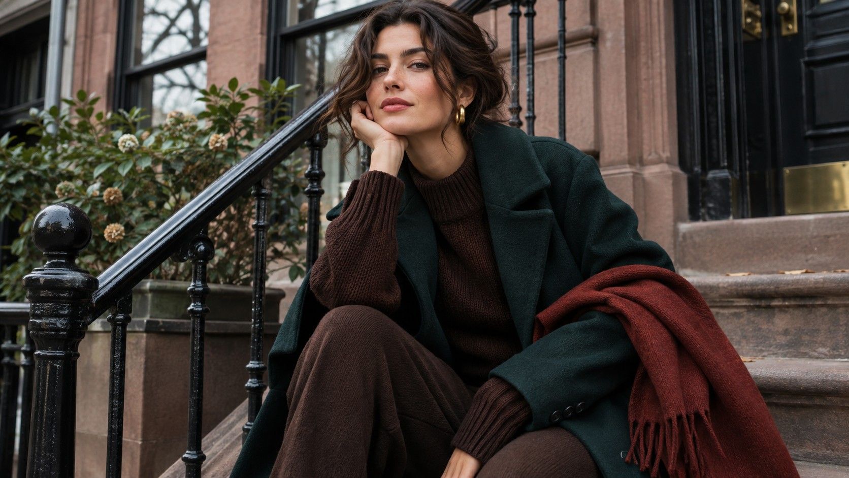
Think through the outdoor version too. Try on the coat with each group. A chocolate coat may hide a deep paprika sweater entirely when buttoned, in which case a soft caramel scarf can bring some of the warmth back. An open coat needs a clearer shirt edge to show the differences in shade. Use the scarf and coat under the same light before choosing which of them provides the lighter border.
Use two fabric tests to distinguish warm depth from cool depth
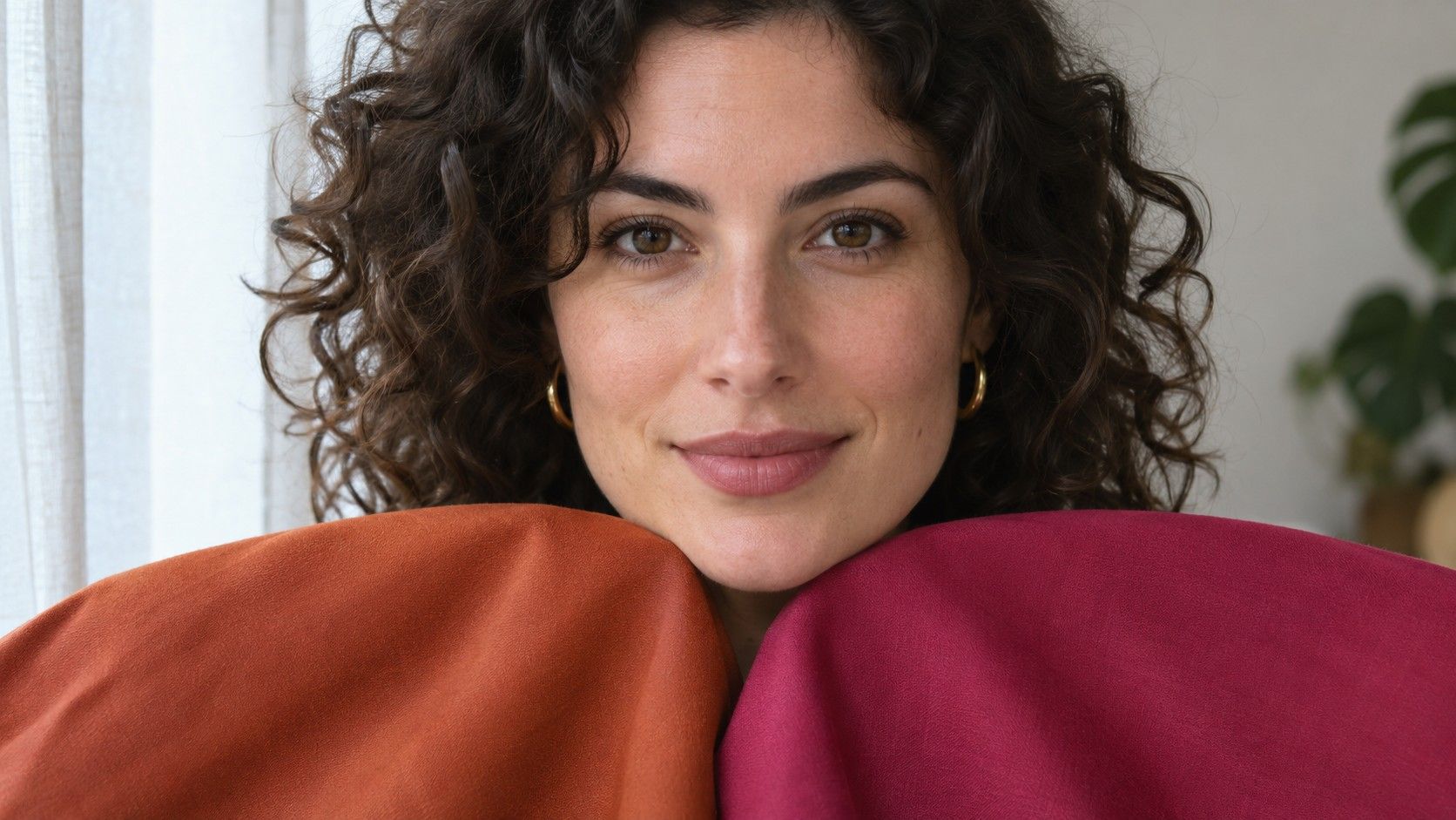
Deep Winter also makes considerable use of dark colors. The easiest comparison to set up at home is two deep reds with similarly quiet fabrics. Hold warm wine under your chin, then a cool berry with a blue cast. Compare the lower cheek and the shadows beside the mouth. If your impression is similar, try a second pair with espresso and dark blue-gray. Write the difference you see down in terms of the garment and the facial area.
When daylight is uneven, turn the chair or change windows. A large dark fabric reduces the amount of light reaching your lower face more than a pale one. That is useful in everyday outfit styling, but it confuses a temperature comparison if the two samples have very different depths. If you have only a very dark cool sample and a medium warm one, add a warm and cool pair closer to medium to check your original impression.
A closer neighbor, Warm Autumn, can give you a test of depth. See whether medium golden brown gives a richer frame or whether you keep coming back to darker chestnut. Repeat with olive, moving from a leafy middle olive to a dark forest. If a middle tone works across both sets, it can serve as a practical top even when your shoes, coat and trousers are mostly dark.
Compare browns after you choose fabric, metal, and print
Dark brown velour can look nearly black in shadow and shine red in full daylight. Dark brown matte wool can retain its softness over a much wider range of lights. If you like the color and keep avoiding the garment, see if its reflection or a strong seam changes your impression. Try replacing large highlights at the collar with a small warm metal earring or an open neck.
Gold and bronze can look dramatically different side by side in front of a dark shirt. Bright yellow gold reads as a sharper point. Brushed bronze may look almost like part of a chocolate sweater. Test them when you are choosing where to put an accent. For eyeglasses, warm dark tortoiseshell often contains pale mottling. The small light spots can make it read lighter and softer than a solid frame with the same base color.
A deep brown patterned fabric may include a small pale background or generous cream shapes. That changes the value contrast of the whole garment. Look at the print with your eyes half closed. If you mostly see a pale field, put the pattern alongside a darker neutral to decide whether a noticeable break is something you want. For less separation, look for motifs where the warm brown remains the main area.
Expand one garment at a time
A deep autumn palette can start with the brownest and darkest neutrals you have already tested. Add one rich accent for tops and one mid-tone for layers before you look at accessories. This makes it possible to see which neighbors each color has. If the first addition is a dark teal, try it against espresso and soft burgundy on different days. Depending on cut and material, a light chestnut layer can make both pairings easier to wear.
When picking a replacement jacket or pair of trousers, take a familiar leather or washable swatch with you. It is easier to see warmth in a fabric when it lies beside a known reference. Save an outfit photo for the depth balance across the whole look and keep a separate photo of the pieces together in daylight. Use both when you shop so a name such as ‘chocolate’ never has to do all the work.