A deep winter color palette works with dark clothes you may already own. The challenge is getting each layer to show. A blue-black blazer over a dark purple shirt can look like a single flat block from across the room. Try a thin strip of icy pink at the collar or a pale silver pendant where the two pieces meet. The light edge gives the face a frame and distinguishes the upper layers.
Give a dark outfit one readable edge
Use charcoal, cool ink, or a dark plum with a blue cast as a second base. Lay one of those beside black in your normal dressing light. If the shades look the same at a distance, separate them with a smoother or shinier fabric. Black cotton trousers against an ink satin blouse can read as distinct because the blouse catches a highlight. Reserve brighter metal or crisp white for a smaller area if the fabric already supplies enough light.
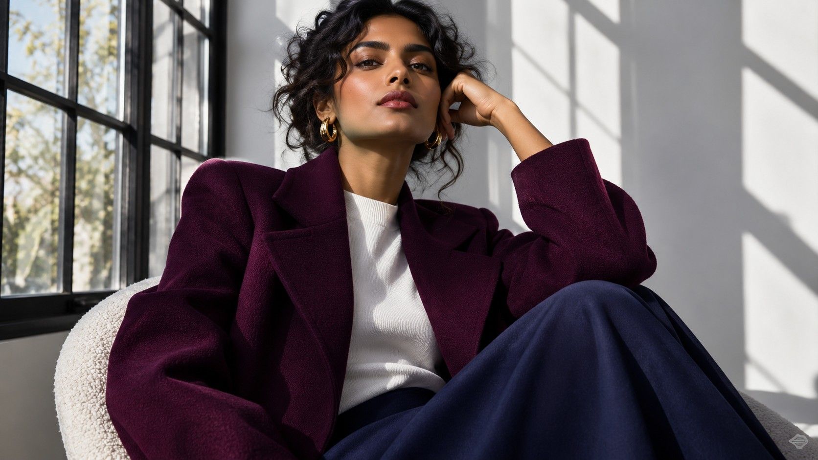
A clean neckline plays a part too. A white crewneck under a charcoal cardigan makes a clear boundary above the collarbone. A narrow white line inside an open black collar creates a smaller one. Try both against a mid-tone top in the same blue or purple family. The strongest boundary can make a useful evening look even if a softer one is easier under bright daytime lights.
Look for jewel tones that stay cool in the folds
Start with shades you can spot by their base color under good light. Blue-based cranberry, pine with a blue-green cast, deep cobalt, blackberry, and cool burgundy give you several usable branches. Hold up two fabrics and check the drape where it curves. A burgundy that reads purplish in the shade often sits more easily with ink than one that shifts to brown. Take the colors to a window if the shop lighting makes the choice feel difficult.
Choose the depth according to how you will use the piece. A very dark teal blazer can carry trousers, a shirt, and a neutral bag without drawing attention all at once. Clear blue earrings or the same blue in a thin cardigan stripe may be easier than a blue coat if the brighter color makes the center of an outfit feel crowded.
One practical group might use ink trousers, a white tee, a cool dark red cardigan and black loafer. For a darker version, substitute a blue-gray tee and add a silver-gray scarf. Put the smaller light color somewhere visible when seated if you spend the day at a desk. A pale sock that works under standing light will not do that job once the legs are tucked under the table.
Compare cool depth and warm depth at home
Deep Winter and Deep Autumn usually share an ability to use dark colors. Start by taking the temperature guess out of a simple dark-pair test. Try two blues or two reds close enough in depth that one cannot win by being dramatically darker. A blue-cast wine and a brown-cast oxblood make a useful red pair. Try black coffee brown beside a cooler charcoal for the second pair.
Observe the lower cheek and the edge of the lips in daylight. A stronger shadow may make the whole side of the face seem heavier. Repeat the comparison from another window if you see that effect in both drapes. If one half of the face is markedly brighter, move the mirror until both sides get similar light. The best notes say something specific about the fabric and the face, such as ‘charcoal kept the lip line clearer.’
A garment that is particularly cool and light can change the comparison. If you like white against ink but ivory also works against warm espresso, test both pairs again with a same-depth lavender gray and sand gray. The original ranking may have come from a big difference in lightness. Give your wardrobe permission to use both favorites if they have clear roles.
Find the amount of contrast you would actually wear
Dark base and icy accent is one way to style this range. You can reduce the size of the light area without abandoning the crisp edge. Wear a nearly black coat with a dark wine scarf that contains one pale blue line. Repeat the line with a shirt cuff and leave the rest of the outfit quiet. Alternatively, pair a white shirt with a dark vest to make the light area feel intentional and face-framing.
Patterns amplify small color changes. In a check or stripe, white and ink recur every few millimeters, so the contrast can register much more strongly than one white collar does. Test the fabric from two or three steps back. If the repeated shapes look like visual noise, sample a bigger pattern with fewer edges or a background in gray-blue and black.
Eyewear is close enough to the face that a slim edge can change how you see your brows and eyes. A frame in blue-black acetate will create a dark line while clear gray softens the same outline. Look straight ahead and then from an angle. The top bar over the brow can feel far more pronounced than the rest of a dark frame. Match the amount of contrast to the whole face instead of judging color at the bridge alone.
Keep clear brights in reserve if they compete with the base
Bright Winter shades may share a cool feel but appear more vivid than the deep tones you enjoy. A very clear magenta drape can help identify that line. Compare it with cranberry in the same kind of knit, then add an ink layer over each. If the magenta looks good as soon as there is less of it, it has a useful job in your palette even if you rarely buy magenta dresses.
When shopping for a coat, look for a shade that holds a defined identity in dim light. A black coat with a distinctly blue cast will fit an ink and cranberry outfit, while a brown-black coat may look separate. A paper swatch sometimes helps in a well-lit shop. When lighting is poor, take the coat next to something familiar such as charcoal trousers. Compare relative warmth and depth before worrying about color names.
The same test works for makeup and accessories. A sheer berry can produce a smaller, cooler accent than the color in its tube suggests, while matte dark plum gives the lips a definite line. Try the color with a coat and top you wear often. A berry that looks subdued by itself can become the brightest point when your top and coat are both nearly black. Keep it where it helps your expression stay readable.
Build the next purchase around an outfit gap
Write down three combinations by garment and shade, such as ‘cool wine shirt, gray wool trousers, black boots.’ Find which one you skip because an item fits poorly or a layer is missing. You could add a charcoal jacket to the wine outfit or a lighter blouse to change how often you reach for a black coat. Make the new piece solve the actual problem before considering the full color range.
A wardrobe can hold a few pieces that live on the edge of a season. A brown leather bag can work with darkest denim and a graphite coat if its shape and texture have a reason to be there. The most informative test is wearing the outfit through a normal day. Make a short note of which colors sat well side by side under daylight, work lights and the light where you arrive in the evening.