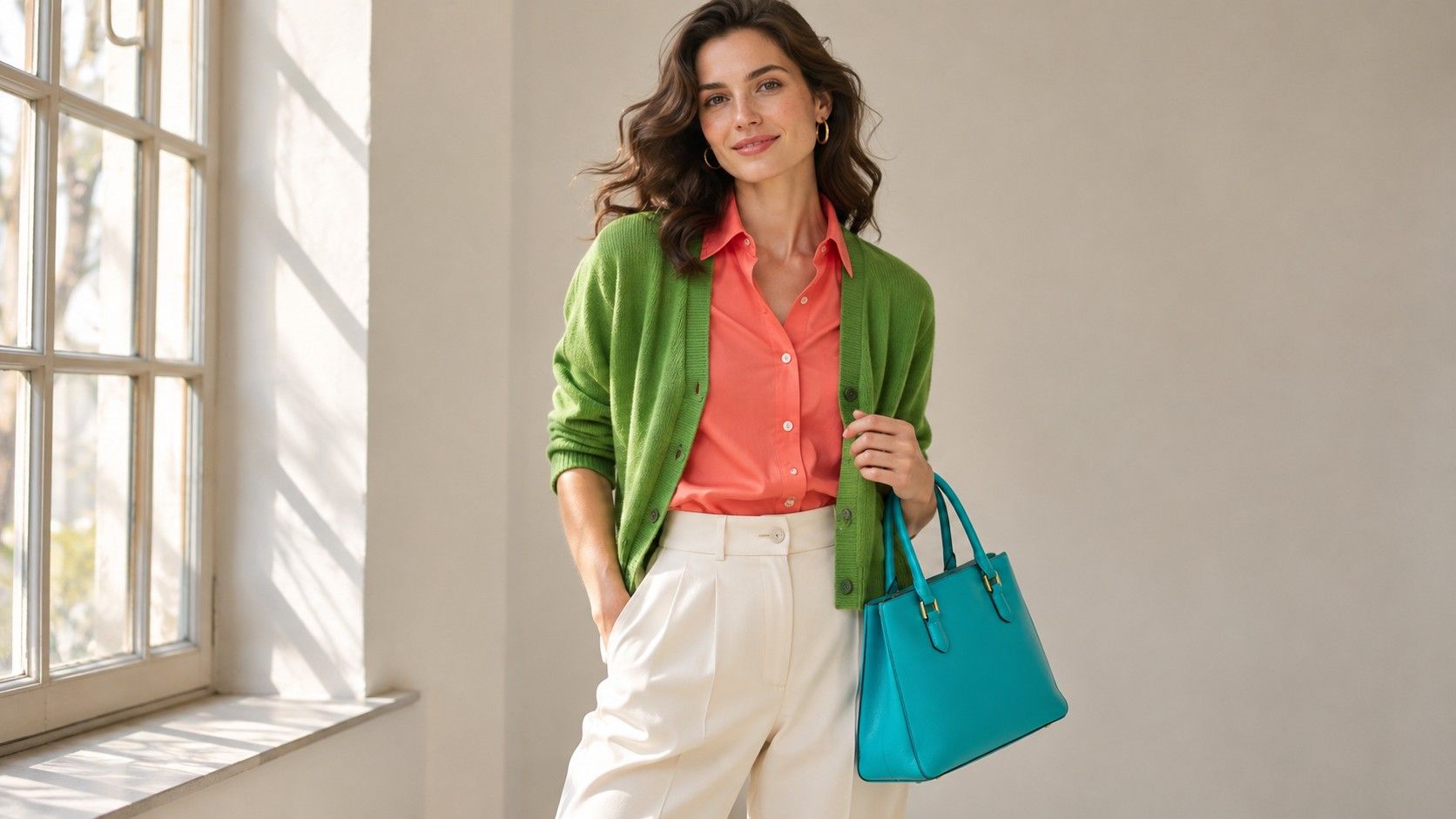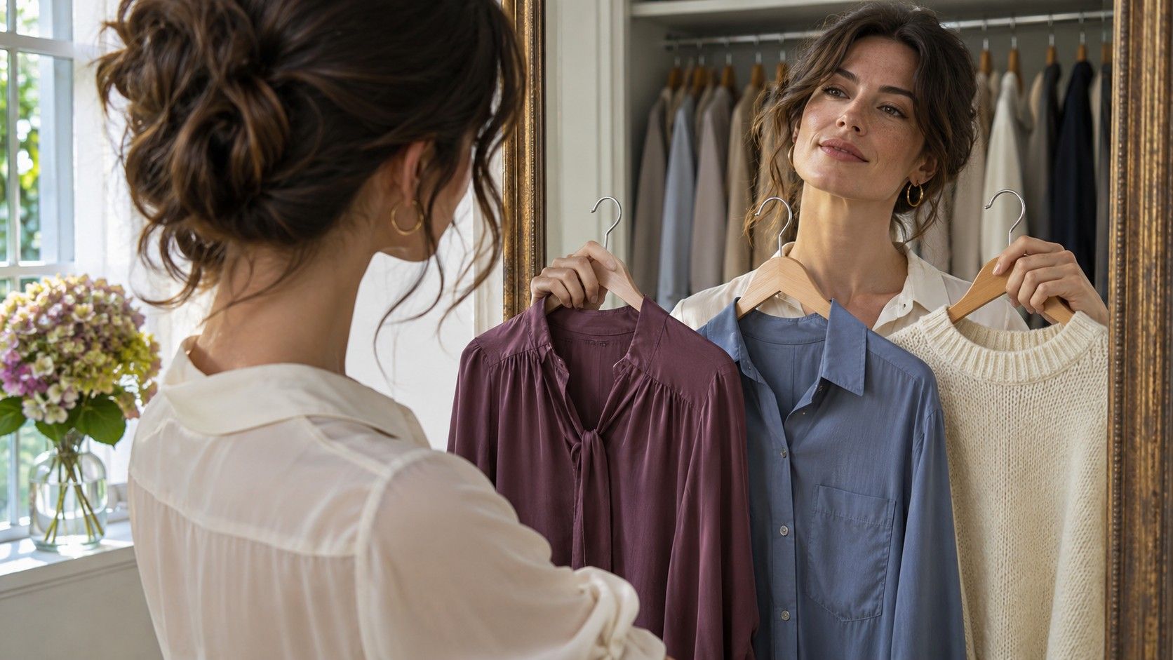
“Where do I start if I want to find my color palette?” Start with the clothes you wear close to your face, the colors you routinely pair, and the shades that looked good in more than one setting. A small wardrobe sample can give you a better starting point for choosing colors than a closet inventory or a striking photo taken under one light.
Pull the pieces that earn their place
Take six to eight things you wear above the waist, including at least two neutrals and two colors. Choose pieces across uses if you can. A work shirt, a casual sweater and a scarf from an evening outfit give you more information than six versions of your everyday tee. Pick the exact pieces you reach for repeatedly and write down when and where you wear them. Try to name each color with a practical description such as blue-gray, honey beige or dark berry.
Now pull three items you rarely wear even though they fit comfortably. Look first for a color you liked on the hanger but hesitate to wear around your face. If you avoid the piece because its neckline feels awkward or its fabric wrinkles by lunchtime, make a note. It can still be useful as a test swatch because you can fold the neckline out of sight, but its low wear count says little about its color.
Set aside clothing you wear for a required uniform, an outdoor activity or a special occasion that comes up once a year. Pieces selected by someone else still belong in the sample if you reach for them freely. The question is which colors you choose when you have options, even if those options are limited to a few sweaters in cold weather.
Look for patterns across fabrics
Place your pieces in indirect daylight, grouping near matches. A rust sweater and a brownish coral scarf may share a soft warm quality even if you would never call them the same color. Charcoal jeans and a deep navy shirt may both work as dark anchors. Give each group an everyday name you can use in a shop. A single word like blue can be too broad to help when you are comparing three blue shirts on a rack.
Notice properties that repeat across groups. Do your favorite greens and reds share muted color even though their hues sit far apart? Are your most worn neutrals all lighter or darker than your accents? Keep at least one outlier visible. The white shirt you wear every week can challenge a quick conclusion that all of your favorites are low contrast. You may prefer white with one jacket, under one particular light, or a little farther from your face.
Fabric changes the reading. Corduroy forms shadows and can make a color look deeper from across a room. Satin reflects a bright strip of light and a swatch can appear clearer from one angle than another. Two items with similar dye may create different effects around your face. Keep the color description and fabric description separate so you can compare a teal scarf with a teal knit without assuming they will behave alike.
Test the colors that solve different problems
Choose one easy neutral, one brighter accent and one color from the rarely worn pile. Compare each at the neckline in the same spot, facing a window without direct sun. Look at the area under the eyes, the edge of the jaw and any shift between the face and the neck. Record the easiest repeatable difference. If the shirt catches your eye before your features, ask whether its lightness, intensity or hue is responsible and make one nearby substitution to narrow it down.
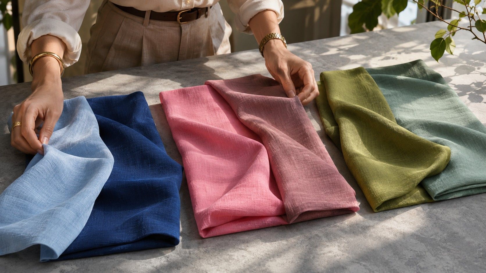
Use pieces you can hold in the same position. A square of folded fabric gives two garments similar coverage. If the brighter scarf still feels strong when folded into a narrower band, try it with the neutral you already wear most. You can also alternate with a softer swatch of a similar color to see whether the shade change makes it easier to use near your face.
Set aside a color if the only time it looks wrong is before you remove a second color from the outfit. Red over blue can produce a more dramatic comparison than the same red over brown. Test your colors alone first and then with one familiar neutral. A pair that works both ways is more flexible for future purchases.
Write a short list you can shop from
Start with two base colors, two color accents and one light option that can sit near the face. A working list might include dark cocoa and faded olive as bases, a rust knit and muted teal as accents, and cream as a light layer. Write a sample combination for each accent. If an accent needs three pieces you do not own before you can see yourself wearing it, save a swatch and leave it off your first shopping list.
Keep a physical sample if you already have a suitable handkerchief or fabric scrap. A daylight photo on your phone helps you remember the group, but compare it with the real clothes when you can. Screens boost color, and a phone display in an amber night mode can make a cool lilac appear closer to dusty pink. A one-line color description is useful even if your image looks different in a store.
Test a missing shade with a reversible purchase, a borrowed item or a visit to a shop where you can examine it by a window. If your favorite raspberry shirt is too dark for summer layering, compare a lighter cool pink with it. Decide whether the lighter pink can take over one specific role before treating it as a new requirement for every outfit.
Keep the list accurate as your wardrobe changes
After two weeks, revisit the colors you picked and record where you used them. Pay attention to the items you had planned to wear but left behind. A brick-red scarf may be ideal in theory and sit out the whole month because it clashes with the only jacket warm enough for your commute. That is a wardrobe issue you can address directly by testing the scarf with the jacket or moving the color to an indoor layer.
If a color is new to you, allow time to get used to seeing it. Wear it twice with the same reliable neutral and judge it after the full outfit has been on for a while. Some palettes feel unfamiliar when reduced to little blocks on a phone because they remove the patterns and textures you normally choose. Build combinations from real clothing and keep the colors that make those combinations easier.
A seasonal name can help you locate more candidates when the same warmth, depth and clarity show up across several pieces. Keep the notes that got you there. They can guide you when a shop calls its particular green moss and an online palette labels a very different swatch the same way.