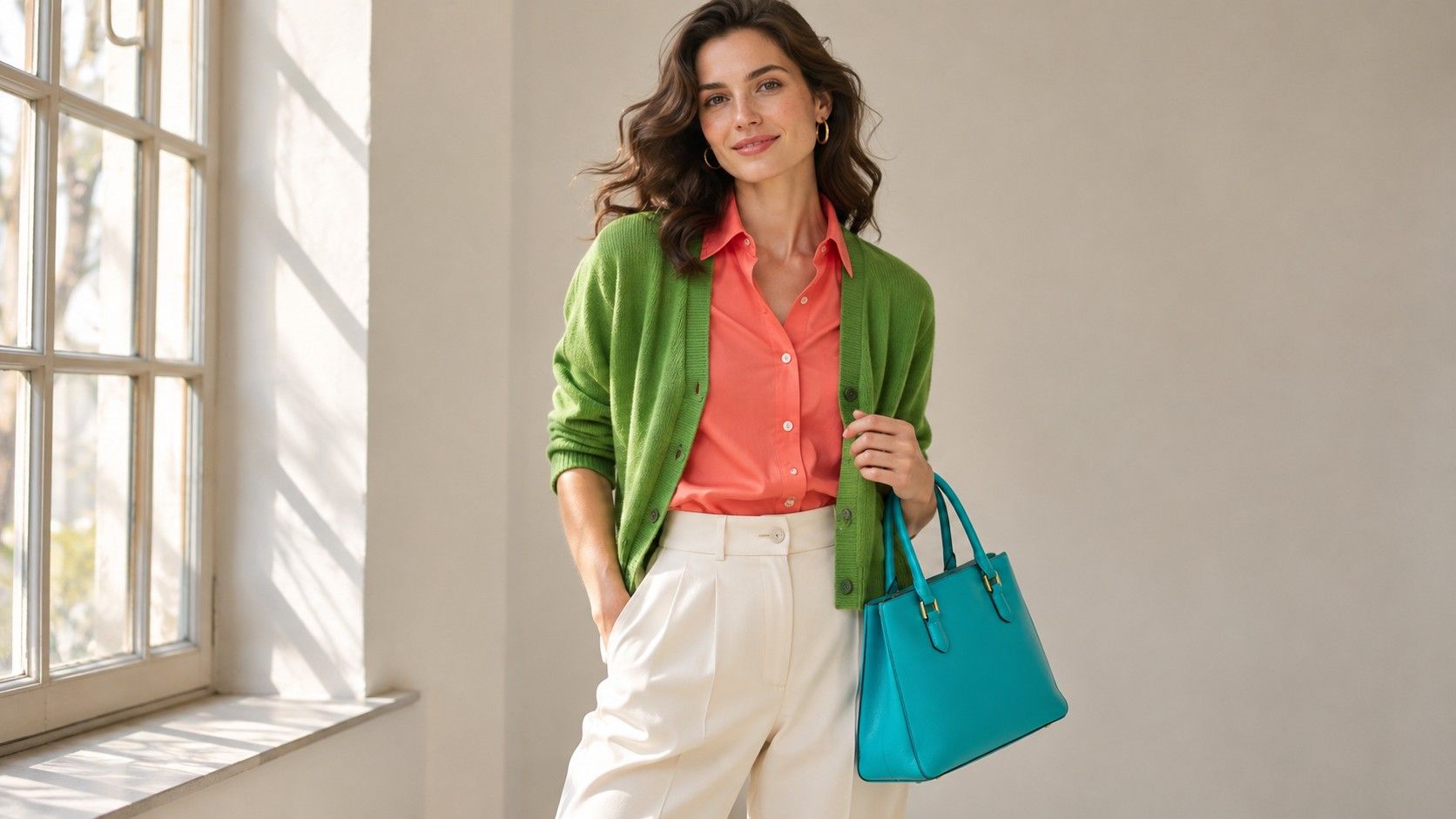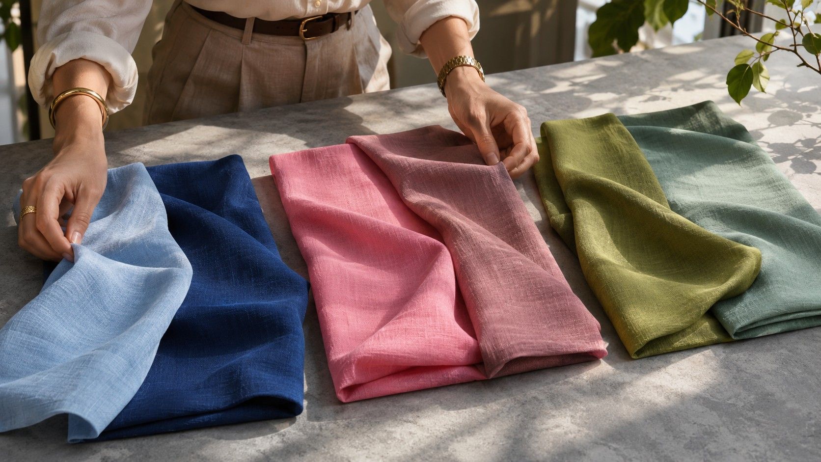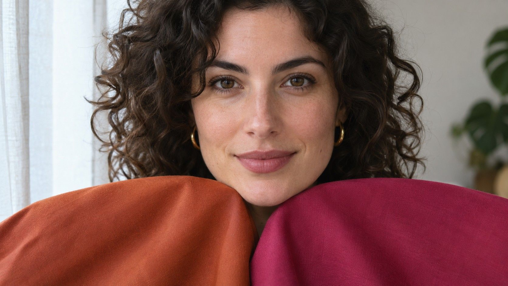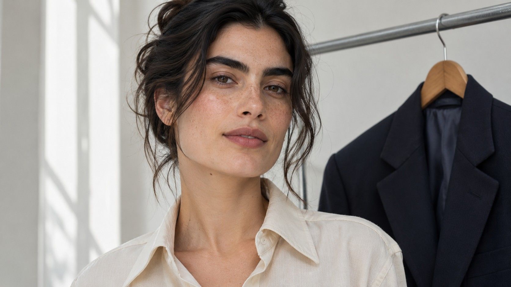
A high or low contrast face test compares light and dark areas you can see together around the face. Focus on the size and placement of the jumps in value among your own skin, hair, brows, eyes and lips. Someone with a similar complexion can have quite different contrasts around the eyes and hairline. Check those jumps in two neutral views first, then see which garment combinations you enjoy repeating.
Check one stable view in a mirror
Look in a mirror in indirect daylight with a neutral shirt or towel. Move your hair into its usual position and notice the areas near the forehead, temples and cheeks. Brow and hair shape influence how much of each value you can see. A short dark fringe can add a large dark area against lighter skin. Long hair tied back may leave just a small band at the forehead. Both views can be useful if you wear your hair both ways.
Compare nearby broad areas before you read fine details. Look at the middle of the cheek and the main part of the brow, the hair at the temple and the skin beside it, then the edge of the lips and the surrounding skin. Ignore bright highlights for the first comparison. A glint in an eye or a reflection on the cheek can be much lighter than the main areas that frame it.
Record the differences as small, medium or large. If your brow and hair read as large differences from the adjacent skin, you may see high contrast in the part of the face that is visible from across the room. If most differences are small, the face may read as lower contrast overall. A strong lip edge alongside soft hair and brow transitions is a mixed result. Write down where the strong contrast appears so you can reference its scale later.
Check a grayscale photo for lighting tricks
Take a front-facing photo from a comfortable distance in the same room. Avoid direct sun across half the face, a bright window behind you and dramatic side lighting. Keep the camera at eye height so you can see both temples. If you use the phone to create a grayscale copy, switch off smoothing and exposure-changing effects first when those controls are available. Keep the original so you can compare how much the filter changed the face.
Check whether the largest difference is still visible under different neutral lighting. A deep shadow at the hairline may look dramatic in the first photo and lighter when you rotate toward the window. Features that create a genuine broad jump in value will often show a similar relationship when both sides of the face receive even light. If you cannot tell due to changes in exposure, rely on an even mirror view and use the photo only as a record.
A grayscale picture can clarify whether a vivid color is actually dark. A lipstick may look strong in color and sit close to the skin in value. An edge can still be visible because the hue differs, even when the measured lightness is similar. Keep that observation alongside the grayscale estimate. Chroma and the edges of facial features affect how you notice a color combination, even though this exercise focuses on light and dark.
Compare a low, medium and high contrast outfit
Use two pieces near your face for the first trial, such as a tee and an open cardigan. Set up one pair of neighboring depths, one with a clear but modest difference and one with a strong light-to-dark jump. A cool example could use steel blue and slate for the first, pale blue and medium slate for the second, and pale blue with ink navy for the third. Keeping the hues close allows you to concentrate on the value change.
Leave the opening of the cardigan the same for each pair. See which looks easiest to wear before examining details. A low-contrast mix may let the eye move quickly toward the face. A strong contrast can echo distinct brows or hair and create enough definition for a structured outfit. A medium contrast may work well when the face has both gentle areas and a couple of stronger edges. Try moving the same two colors around before deciding which effect you prefer. A narrow stripe of light blue inside a dark cardigan can look quite different from a mostly light outfit with a narrow dark edge.
Take a quick photo if you struggle to judge the outfit in the mirror. Look at each pairing in an image sized for an ordinary profile photo as well as full screen. You can see which larger areas carry the outfit in the small version, then check the neckline and skin detail in the larger frame.
Consider scale when choosing patterns
A stripe with a dramatic change in lightness may feel quieter when the stripes are small and packed close together. From farther away, the dark and light areas blend into a middle value. A wide cream stripe on a dark top keeps the full contrast visible across a room. How you read the pattern depends on both the difference between the parts and the size of each part.
Compare a two-tone print with one that has a middle-value bridge. A pale gray, medium blue and deep charcoal pattern can feel easier than the same pale gray against deep charcoal because more of the pattern continues through the middle. See where the darkest bits land in relation to the neckline. A modest dark detail that repeats the shape or depth of a brow or frame can give definition even when the largest areas of the garment are lower contrast.
If your clothes have metallic buttons or bright trims, include them in the comparison. Reflective buttons can catch small highlights that were absent when you looked at the fabric alone. Matte buttons in a similar value may reduce how much they compete with an otherwise subtle neckline.
Recheck the version of your coloring you dress for
Changes in hair color, brows, glasses and lipstick can alter the visible contrast you plan an outfit around. A dark eyeglass frame can create a strong value edge in a face that reads gently without it. A silver streak near the temple can add a lighter note alongside a darker base. Check both the natural features and the framing you wear frequently, using two views if your weekday and evening styles differ.
Write down a few outfit pairs that seemed right. One might be a dark jacket with a pale shirt for a sharp look, and another a quiet blue-on-blue combination for ordinary days. The test gives you a scale for choosing where to place light and dark. Keep the examples that help you recognize that scale quickly when you dress.