If ivory and a soft cool white both seem wearable, you may be able to borrow from either side of the temperature range. A neutral undertone color palette starts by finding out what both fabrics have in common. They may have similar softness or depth, and those shared traits can be easier to build a wardrobe around than the warm or cool label.
Start with two near-identical fabrics
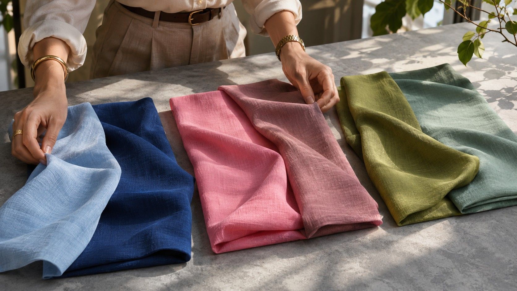
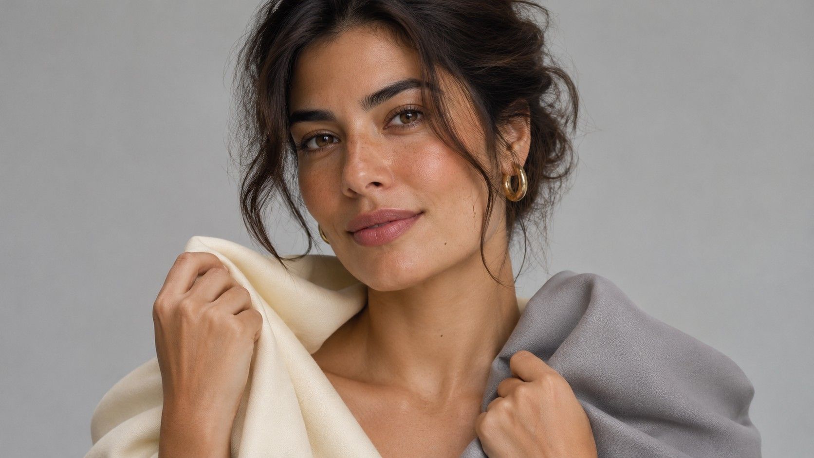
Set up near a window with indirect daylight. Put one cream and one soft white garment by your face, leaving the rest of your outfit out of view. Try to use two fabrics with similar texture and opacity. A white satin blouse throws light upward in a way that a matte cream sweater cannot, so compare two matte samples before you put any stock in the result. Take them away between looks and move back the same distance each time.
Look at the area around the mouth, the transition from cheek to jaw, and how clearly you see the eyes. Do these features stay easy to see with both samples? Write down which feature changed and how. If your impression depends entirely on which fabric you put on second, reverse the order. One answer that changes three times is a comparison worth repeating on another day.
Separate temperature from brightness
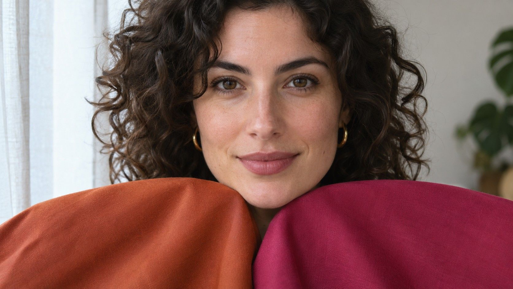
Paint chips and color names can help when you search for a shade, but the gap between two options is what matters in the mirror. Start with dusty rose and soft peach approximating the same depth, then look at a clearer version of the better color. This gives you two comparisons with different jobs. The first tests a pink leaning cooler and a pink leaning warmer. The second asks whether a stronger color takes up too much visual space.
For a darker pair, place cool cocoa beside warmer chestnut. Cocoa in a soft wool shirt may look calmer than a polished chestnut leather collar. Match the finish, or compare both shades using matte scarves. If both browns are heavy, try medium mushroom and tan. Working at a different depth is more informative than declaring yourself unable to wear brown.
Some people find the same color easier to wear once the neckline changes. A dark crewneck comes right up to the jaw. An open collar gives skin more room and reduces the size of that dark area. When you want to judge hue, keep the cut as consistent as possible. When you want to decide whether to buy a garment, include the cut in the decision.
Pick the neutral you can wear near your face
Put three candidates on a rail, chair or bedspread. A thoughtful group might include oyster, mushroom and soft navy. Test each one as a top and choose a light or middle shade you could wear twice a week. Save a darker option for a coat or work trousers if it is less comfortable right by the face. The result may be a personal split between an easy collar color and a useful bottom color.
A small collection might pair a soft white tee, slate trousers and a mushroom cardigan. Slate fits with cocoa, dusky blue and soft burgundy, which gives the same trousers several upper layers to work with. When testing a candidate anchor, make three outfits from pieces you already own before you order anything. A color that passes the mirror test and spends a month waiting for matching garments has limited value as a staple.
Check neutrals in the light where you will use them. A taupe skirt may look evenly brown-gray at home and read mauve under office lighting. Lay it beside your shoes and coat there if possible. This matters especially for textured garments and so-called matching sets that pull very different shades under the overhead lights of a fitting room.
Use the color that works on both sides
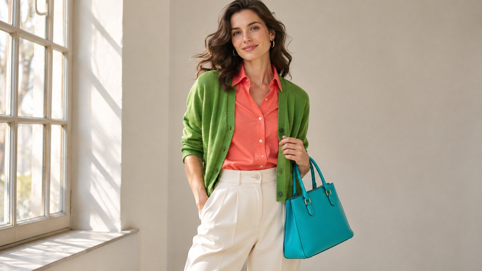
A neutral-leaning set can combine colors across temperature lines when their depth and intensity are close. Try a muted petrol blue knit with light camel pants, or a rosewood shirt with charcoal denim. Adding one shared shade from another piece ties together the outfit. A brown and blue woven scarf can connect camel and petrol. Navy accessories can play the same role with soft white and rose.
When the two accent colors feel disconnected, give one a smaller area. A pale peach shirt and a medium slate skirt may look more balanced once you switch the main shirt to slate and wear the peach in earrings or a bag. Compare a full-sized fabric drape first. Tiny samples conceal the effect of square inches on how strong a color seems.
Metals are another place to use a mix you like. Brushed silver beside matte pale gold gives a gentle transition. Polished pieces reflect light strongly and can make a jewelry comparison hard to read. If metal is important to your wardrobe, try an earring on each side, then swap them. A side of the face that receives more light can make its earring seem automatically brighter.
Recheck a neutral result when olive enters the picture
If beige, pink and creamy off-white all produce a similar mismatch, clay pink and dusty olive are useful fabric comparisons to add. Some people describe a greenish or gray-green cast to their skin as olive. That appearance overlaps with warm, neutral and cool leaning preferences in color draping. Clothing colors can change the prominence of the cast, so a favorite color label on its own has limited value.
Try a gray-green drape and a yellow-green drape of similar depth. A difference between these two can help you choose a green for clothes without settling a skin label. Compare the better green with equally muted rose and slate. Note whether the softness does most of the work, or whether keeping a cooler or warmer bias makes a visible difference. Repeat the test with bare skin if foundation or bronzer changes how you see the jaw.
Save the winning fabrics or take a single picture of them lying next to each other on white paper. Photographing them together gives a usable reference for relative depth even on a screen that shifts color. Write a small description too, such as ‘glossy mushroom turns pink’ or ‘olive shirt works next to natural linen.’ The notes give you something concrete to compare when a shop lists both garments under the same color name.
Buy against a three-item outfit
Before buying shoes, a blouse or a coat, decide which two items it will work with immediately. A mushroom blouse could sit with dark gray trousers and a warm gray jacket, or clay loafers could connect a dusty pink top to medium olive. Bring one washable swatch or a small accessory in the best neutral when you shop. It helps you catch differences between the new garment and the shade your closet supports.
Repeat the useful comparisons over a couple of dressing days. Note which colors feel comfortable by your face at the amount you actually wear. A strong shade that feels excellent on a narrow stripe may be worth keeping as a print detail. Over time the most useful neutral undertone color palette is the small set of combinations you reach for, with room for a navy one day and a gentle brown the next.