A Soft Autumn color palette revolves around warm colors whose intensity has been turned down. Sage, camel, tan and rosewood give you a range of useful shades for clothing with little hard contrast. Start with one muted color that already works for you and look at what happens when you wear it with other pieces of similar depth. Small shifts between two greens or browns usually tell you more than replacing a whole outfit at once.
Test muted warmth with two kinds of drape
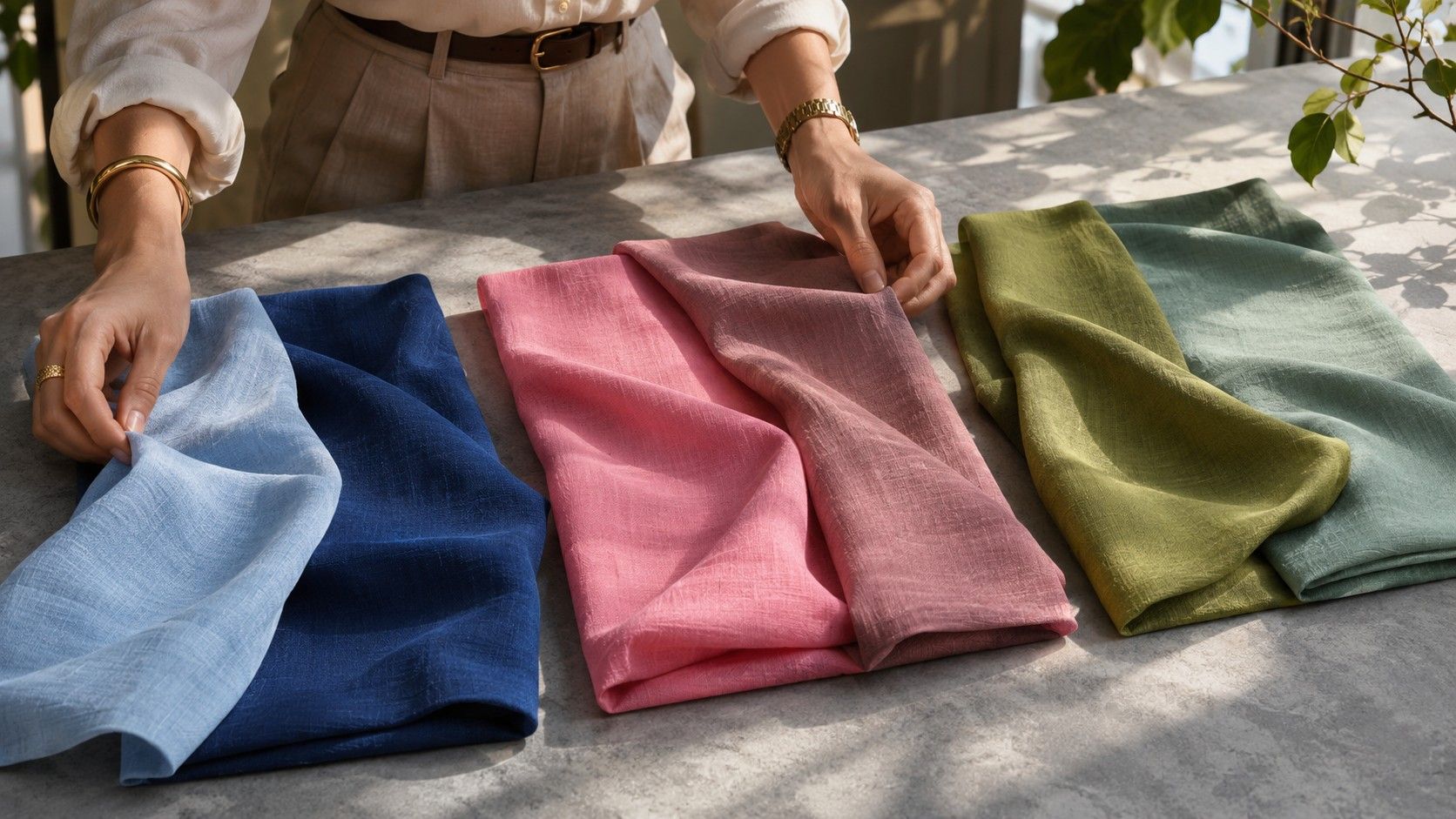
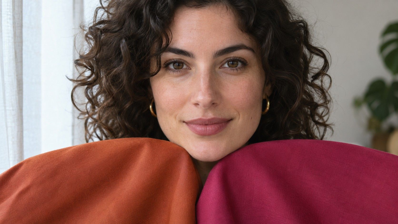
Place a muted olive and a smoky blue-green in indirect daylight. Pick fabrics of similar darkness and finish, then try each near the chin with your hair and clothes in the same position. Olive can cast a warm reflection onto the skin, while blue-green can pull the comparison in the cool direction. Notice whether your features seem more distinct, how the shadow beside your nose appears and whether the fabric takes over the first impression.
Repeat with a warm rosewood and a cooler muted mauve. A brownish rose can give you warmth without the brightness of a coral, while a blue-based mauve can keep the softness and change the temperature. A result that agrees across the greens and reds makes it easier to choose between Soft Autumn and Soft Summer. If the results split, check whether one sample is much darker or has a stronger sheen. Those differences can explain why an otherwise promising fabric seems off.
Give your eyes a moment to reset between fabrics. Keep a plain neutral cloth on your shoulder to hide your actual neckline during the test. If you take a photo, avoid switching rooms or turning on a second light midway through the comparison. Use the images for side-by-side notes and repeat anything you are unsure about in person. Automatic white balance may make two fabrics look closer together on the screen than they looked in the mirror.
Find the upper limit on warmth and saturation
Try your favorite muted olive next to a richer golden olive or a clean leaf green. Then compare a subtle warm brown with a stronger copper. If the grayish quality helps the lighter colors settle in and the brighter fabric feels distracting, softness may be the feature that makes the most difference. An orange-brown scarf from a Warm Autumn selection may still work in a small area. Compare it folded into a narrow band and opened across the shoulders so you can judge the amount of visible color.
Beige varies widely. A yellowed tan, a pinkish mushroom and a grayish flax may all be called beige on a tag. Put them near your face under a white ceiling or near a window. The same color can read quieter against a brown coat and more yellow against a cool gray coat. Save the exact shade that works under your own layers, especially if it is a color you plan to buy more than once.
Soft Autumn has room for colors with a little depth. Try a warm espresso knit next to a khaki shirt. Leave a small part of the shirt collar showing and see whether that transition looks more balanced than espresso with white. A chocolate shade can be useful for belts, trousers, bags and boots even if you usually prefer something lighter next to your chin.
Put sage and camel to work in outfits
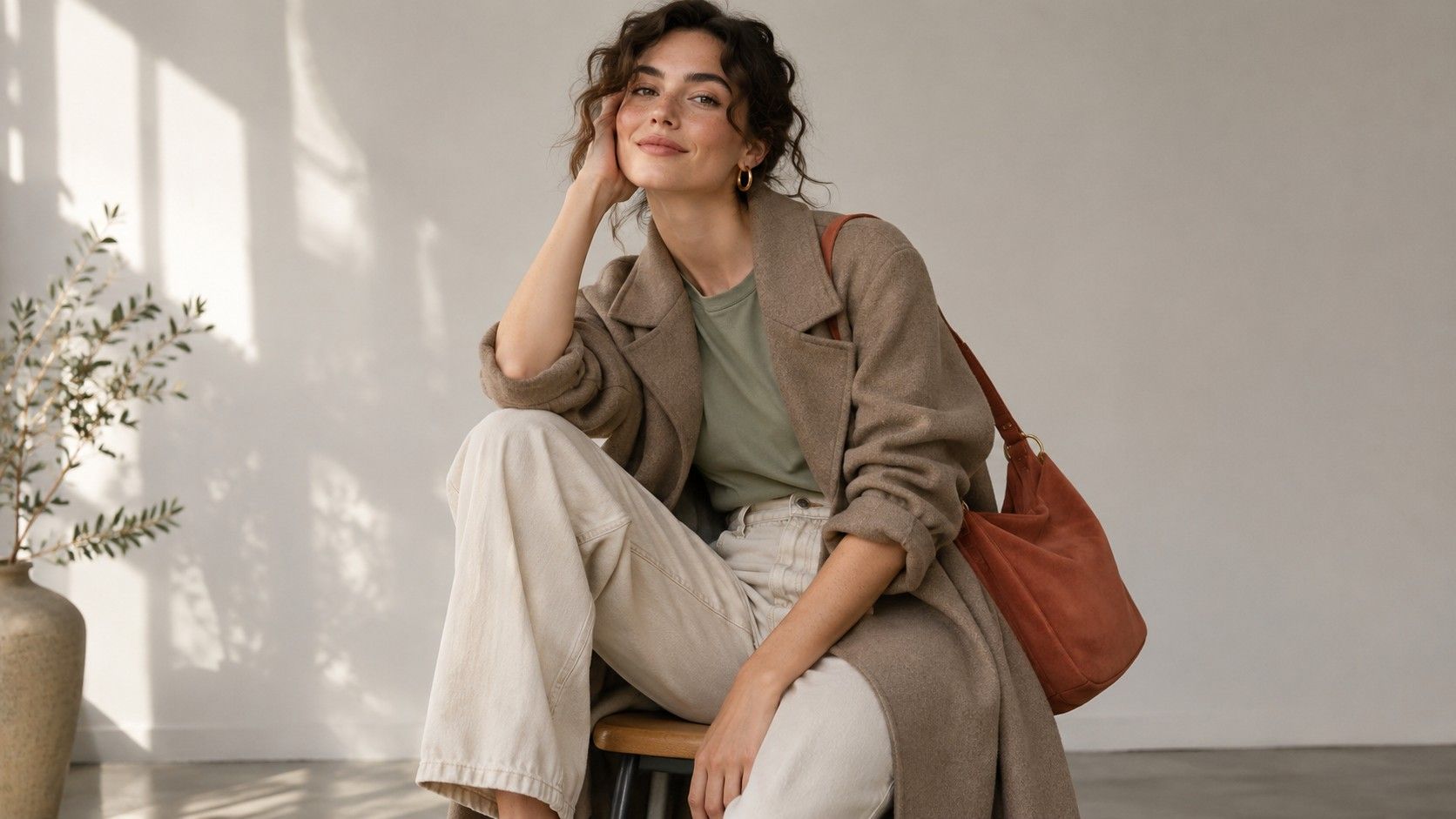
Begin with one light anchor, one mid-depth shade and one dark foundation. A soft cream tee, sage overshirt and tobacco trousers give each color a clear role. The cream pulls some light toward the face, the sage does most of the color work and the trousers give the outfit weight. Brown shoes can repeat the trouser color and make the transition at the hem feel quiet. Change the shirt to rosewood and the boots still have a job.
For a dressier version, try a dusty teal blouse with mushroom trousers and a cognac bag. If the bag suddenly looks orange, add another warm note in a belt or put it beside a more golden brown trouser. Your main palette becomes easier to wear when your neutrals support the accents you already own. There is little reason to buy a full set of sage clothing if sage mainly works for you as a collar or lightweight outer layer.
If a tonal outfit seems flat, check the three materials before you add a vivid shade. A matte knit, smooth cotton shirt and lightly polished leather belt can show different surfaces under the same light. You can also make the outline easier to read by using a darker cuff or shoe. The changes give the outfit structure while keeping the quiet color balance you wanted near your face.
Translate the palette to jewelry, lips and prints
A brushed gold chain, antique brass buckle or soft bronze frame can complement muted warm clothing. Try the exact metal against your usual neckline. A broad band of highly polished yellow gold makes a different impression from a narrow brushed gold earring. If you live in silver, put your own pieces next to a muted teal or cream top and see how the cool metal sits against that color before buying replacements.
For lip color, begin with a sheer warm rose or brown-rose near the depth of your lips. Try it with both a cool-toned shirt you already own and your best warm drape. The shirt can affect how orange or brown you perceive the lip color to be. Check in daylight and the indoor setting where you expect to wear it. Use the same application thickness when comparing two shades.
A print with a camel background and evenly spaced sage or cream marks tends to keep the overall contrast low. A black background with miniature rust flowers will usually look mainly black at a few steps away. If you love the pattern, a skirt offers room to keep it while using a quiet warm neckline. Try the pattern with a tan belt or brown shoe that picks up one of its warmer notes.
Keep a narrow swatch group for shopping
Take a photo of three things together in daylight, such as a sage shirt you trust, a warm neutral you wear often and a rosewood accessory. Put the same items next to an unloaded plain background so you can remember how they compare. Use the picture to choose candidates and take a small fabric swatch for a final in-person comparison. Screen color can shift with brightness or display settings, especially when several samples are nearly neutral.
Bring a return candidate to your closet before you remove labels. Hold it against the three things in your swatch group and make two distinct outfits. If the colors fit and you still cannot find a combination you would wear, the missing piece may be a pair of shoes, a layer or a useful shape. That experiment tells you whether a shade can become part of your daily wardrobe or belongs in a smaller role.