A soft summer color palette can look washed out when every piece is equally pale. Start with a pair of colors you can read at arm’s length, such as weathered denim and rosewood, and look at how their softness affects the outfit. One base with some depth gives dusty colors a place to stand.
Find the shades that make the soft part visible
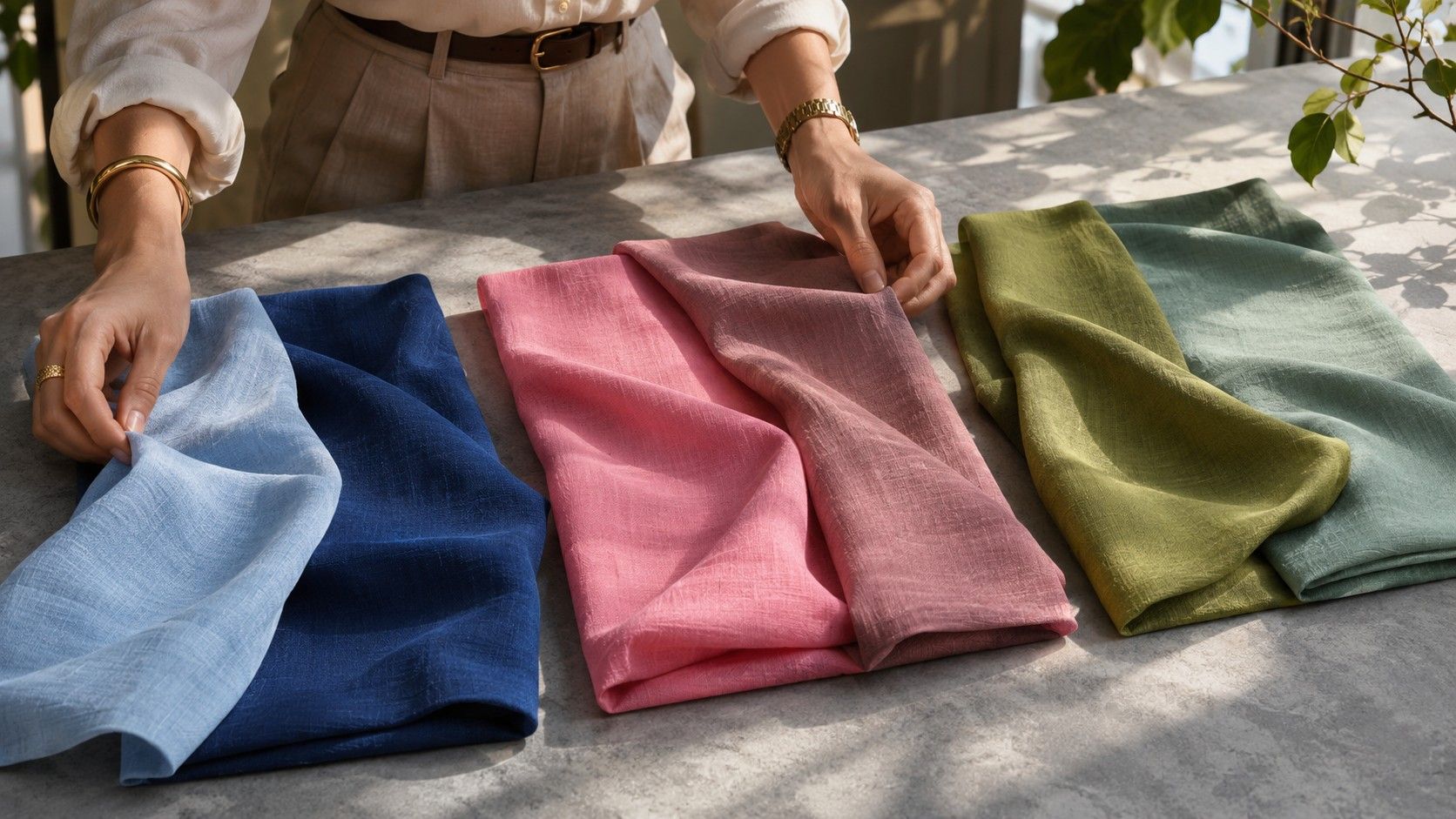
Look for blue, gray or violet somewhere in the mix. Think slate in faded jeans, mushroom in a fine knit, and cool rose in a cotton shirt. Shades can look richer when they are matte. A soft pink silk scarf may shine almost white in a sunny fitting room while a similar rose in brushed cotton holds its color across the folds. Use matte fabric for the first comparison so you can see the underlying hue.
Test the darkest option you could wear comfortably near your face. Deep slate, blueberry and faded indigo are good starting points. Put it beside a pale dusty blue top and walk a few steps back. If the dark option stands out as a separate shape before you see the face, try a little less depth or give the darker shade a smaller area in the outfit.
Make a four-piece outfit with a visible focal point
Use blue-gray jeans or cool medium taupe trousers as a base and pick a top with its own clear hue. A muted berry shirt is a useful example. Add a light gray tee underneath an open collar and finish with a bag that matches either the trousers or the berry. At least one line between garments remains visible even when you choose soft versions of each color.
If you like tonal dressing, make the difference in texture or value do some work. Wear a silvery fine knit against dark heathered slate denim, then use a smooth belt so the waist has a defined edge. Head-to-toe dusty blue can work well with an outer jacket that is visibly darker than the tee. A dim photograph from a few steps away will show you whether the layers read separately.
For a dress, choose a print with a main shade that is half a step darker than the ground. A dusty violet flower on soft gray will often be easier to work with than a pattern with black outlines. Test a piece large enough to cover the neckline. A tiny printed accessory can look gentle even if the same graphic repeated over a dress takes up a lot of attention.
Tell quiet cool from quiet warm
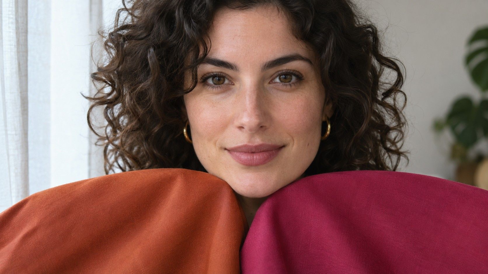
Soft Summer and Soft Autumn both use subdued colors, so muted fabrics can help you tell whether the bias within those fabrics matters. Compare a cool mushroom knit and a sandy camel knit matched as closely as possible in lightness. Try a second pair with rosewood beside muted terracotta. Color names shift across shops, so use the fabric to tell you which of the two looks warmer.
Pay attention to whether the area under the eyes looks more shadowed and where the complexion seems more even. Both fabrics will reflect some light toward the face. A strong pink reflection on the jaw says more about the intensity of the drape than the right season. Move the fabric farther down for a second look if the immediate reflection is distracting.
If you settle on cool rose and warm taupe, keep them. Some useful wardrobe colors lie near the boundary. The second question is how much warmth you can add in one outfit before it starts to shift the effect. Try a muted camel in shoes first, then compare it as a scarf, while everything else stays the same. A cool slate jacket often makes this transition easy.
Check how light pastels and deeper cool colors behave
Light colors can carry quite a lot of clarity. An icy pastel top may look more vivid than a gray-based powder blue even if both are very pale. Hold samples side by side in daylight and study the color in the shadow of a fold. Ice blue tends to keep a crisp blue cast while a gray-based powder blue can look almost steel in the fold. For a gently muted outfit, the steel cast helps connect the top to medium blue trousers.
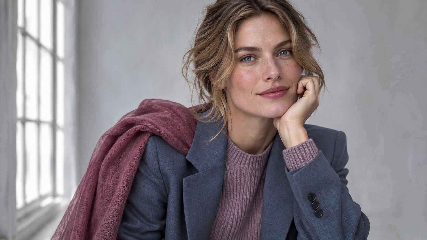
On the deepest side, charcoal and softened navy are useful. Black can be comfortable in footwear and trousers. When black is the only available blazer, try a matte fabric and an open front over dusty heather or medium denim. The layer closest to the jaw now gives the outfit its main facial frame. Compare that outfit with a black high-neck top to see how much difference the edge makes.
An unexpected place to test depth is eyewear. A wide black frame creates several dark edges near the eyes, while a translucent gray-purple frame spreads the contrast more gently. When trying frames on, look from a distance as well as directly in the mirror. The effect from across a table is where the frame thickness starts to matter.
Turn existing clothes into a small set of combinations
Put the easiest cool-toned trousers you own on the bed. Add two or three tops you like beside your face, such as a muted berry tee, a gray-blue button-up and a lavender-gray sweater. Lay out socks or shoes that could work with all three. Soft black boots and indigo flats can both make sense if their depth matches the trousers. Having a choice on the bottom also helps when materials change with the weather.
Build one weekend and one work combination with the same trousers. Weekend might be straight jeans, a faded blue hoodie and a lavender beanie. Work might be an iron-gray jacket over rosewood with the same jeans or soft wool pants. Compare the amount of contrast in the necklines. A collar that opens to a much lighter inner shirt adds definition even when the shoes and trousers are subdued.
When you need a missing piece, take a reference with two tones in it rather than a single web swatch. A woven scarf with cool taupe and slate can guide a decision about tonal distance as well as hue. Let the new garment meet both reference colors under daylight. If it makes both appear warm and yellow by comparison, it may have more blue or violet than the rest of the set.
Keep the pieces that earn their place
A comfortable palette has room for known exceptions. If a warm yellow bag works with a favorite dark coat, keep pairing them. A pale gray cardigan that fits the season description but makes every outfit look equally light can go back into the closet while you try a deeper anchor. Seasonal palettes give you a way to describe what the clothes are doing in the mirror.
Save combinations by occasion, such as ‘smoky navy trousers with faded blue and silver,’ so you can use the same value range with other colors. For the next purchase, identify the place in those combinations it will fill. That might be a cool brown bag with enough depth for both your office trousers and your weekend denim.