A warm autumn color palette can feel obvious when you see a row of harvest colors and less obvious when a shop puts cinnamon, brick, and rust under the same label. Use a few fabric comparisons to identify the shades you feel comfortable wearing. A good starting pair has one quality you can compare clearly, such as gold-brown beside cooler cocoa in a similar fabric.
Compare similar colors before settling on a red or brown
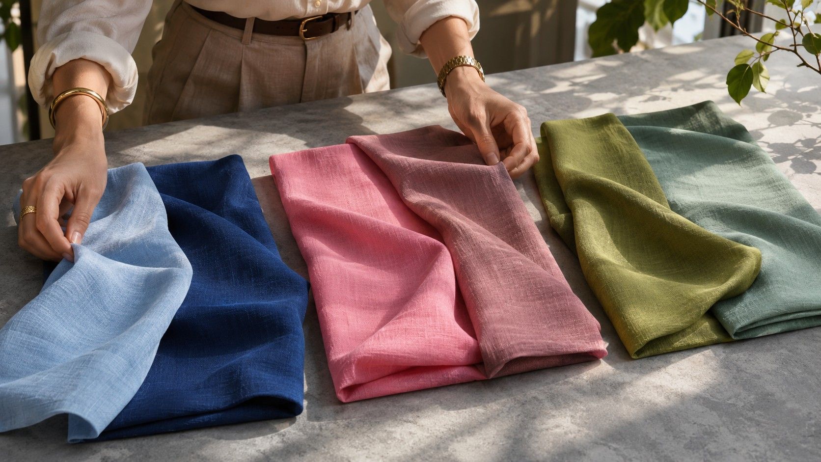
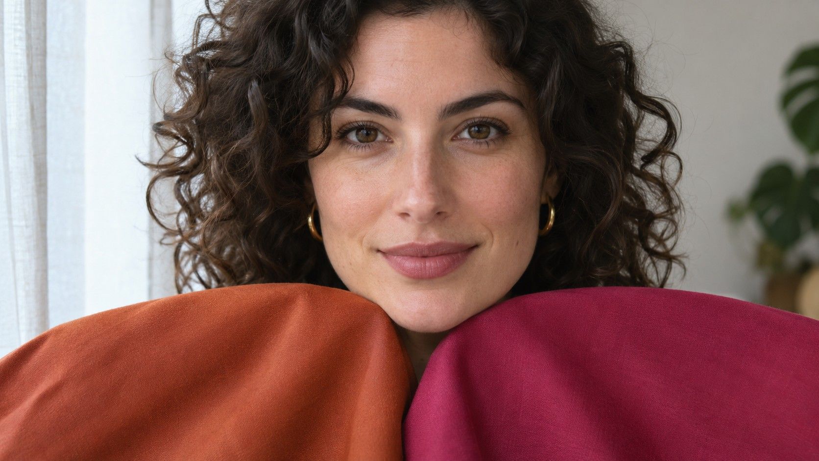
Pull together two shades of brown from clothes, scarves, or fabric scraps. Choose pieces close in depth and finish, and hold each under your chin in window light. Watch the line from cheek to jaw. In the warmer version, see whether you can still read the same shapes clearly and whether darker areas draw your eye. Put the second shade away while you judge the first so it cannot skew your view.
With reds, lay muted brick next to a softer blue-red. A red that appears slightly ochre or brown beside its neighbor tends to fit an autumn set. Check the shade when the fabric folds. The brown or orange in a brick knit usually stays visible where the light hits a fold, while many cool burgundies show a blue or wine edge. A printed swatch and a phone photo are useful reminders once you have established the difference with fabric.
Choose a brown neutral that works beyond the collar
Camel, tobacco, and dark olive can all anchor a day-to-day wardrobe. Compare them using a garment you already wear. A brighter mustard sweater may harmonize with brown jeans, but will it fit the three shoes you own? The combination that works across pant weights, boots and an outer layer earns its place more quickly than a near-perfect camel for one novelty outfit.
Pick a light neutral you can wear as a visible layer. Unbleached cotton, oatmeal with a golden cast, and soft cream are good candidates for testing. Stack each one directly against the main brown. If the cream looks vivid white from across the room, try darker ivory. If oatmeal seems the same value as the travel jacket you plan to pair with it, make the knit darker or open the jacket to reveal more of the shirt.
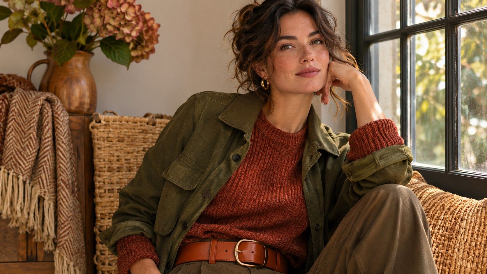
For workplace clothing, try a tobacco jacket, cream shirt and dark olive trousers with a plain brown shoe. For a lower-contrast weekend version, a tan jacket, moss-green tee and brown jeans cover the same range of warmth with less separation. Record the two combinations independently. The more formal look may need a crisper collar, even when both outfits follow the same color relationship.
Use mustard and rust without asking them to match everything
Choose the largest warm accent according to where you want the eye to land. An ochre top has a clear focal point over brown trousers. Add a cream collar if the ochre feels too dense high up. Rust trousers under a moss top put the color farther from the face and give a practical use to an orange-red you enjoy in smaller doses. A rust scarf can connect the two pieces when one has a pattern.
If mustard looks dull indoors, see whether the garment is mainly brown or whether the light is changing. Take it to a window. Very flat beige can eat up much of the rich gold in a mustard scarf. A darker green gives the warm yellow more space to read as its own color. For visible separation with two middle tones, try an open jacket with a lighter inner top or a short dark belt in between.
A color can feel bigger than it measures when it occupies the upper third of a photo. If a rust jacket and mustard shirt compete, swap the shirt for cream and move the mustard to a sock or belt edge. Reverse those roles for a second option. The useful relationship is how much each garment contributes once it is on your body, so check the outfit in a full mirror before deciding which combination to keep.
Test the edge between Warm Autumn and nearby seasons
A spring-leaning orange and an autumn-leaning orange can both show warmth. To check intensity, put clear tangerine beside faded paprika at a similar lightness. Compare the space around the mouth and eyes from a step away. If tangerine fills the view long before you notice much else, repeat the test with a softened red-orange. Both drapes may be easy to wear as long as you give the stronger one less space.
To compare with Deep Autumn, trade a medium chestnut drape for a dark brown of similar warmth. If the dark one works better with a lighter inner collar, the added value contrast may have solved the problem. Close the neckline and compare again. Try deep olive and mid moss as a second pair. Two related comparisons make a better wardrobe guide than a single favorite shade.
Some fabric responses will sit near a border. If moss looks good as a matte sweater but the same hue in glossy nylon catches too much light, note which version worked. Shades often seem clearer in glossy materials than in dry knits and suede. An accessory can give you a darker, shinier bit of color while the wider surface at the neckline remains matte.
Bring the palette through shoes, prints, and layers
Look for prints whose background resembles a neutral you own. A cream field with small olive and rust marks is easy to place beside tobacco trousers. A rust print with thick black lines creates a separate contrast question. If it makes the outfit feel busy, test a version with dark brown outlines or wear the dense print lower on the body. Allow the top to pick up one color from the pattern at a similar intensity.
Brown leather shoes sold as cognac can vary from rich dark reddish brown to pale honey. Compare a shoe to the actual trouser hem. A light honey shoe that stands out under dark olive may make an outfit feel cut off at the ankle. A chestnut boot has more continuity, while a strip of cream sock deliberately adds some contrast. For comfort across outfits, choose the depth you wear most often and keep one brighter leather accent if you like the separation.
For an outer layer you wear every day, think through what remains visible when it is closed. A buttery cream scarf over a dark moss coat keeps light near your face. Once the coat opens, a dark copper knit can blend into the coat more than it did in the shop. Put a light inner shirt where the two colors meet if you want the separate layers to stay legible. Check the same combination on a cloudy day before assuming it needs a different coat.