What colors look good on me when I put on a full outfit? A shade that feels awkward in a full sweater can be delightful along a scarf edge, and a beautifully flattering shirt can leave you hunting for something to wear with it. Outfit color works through placement and amount. Start with a few colors you know, then build complete combinations for the situations you dress for every week.
Choose where you want the color to appear
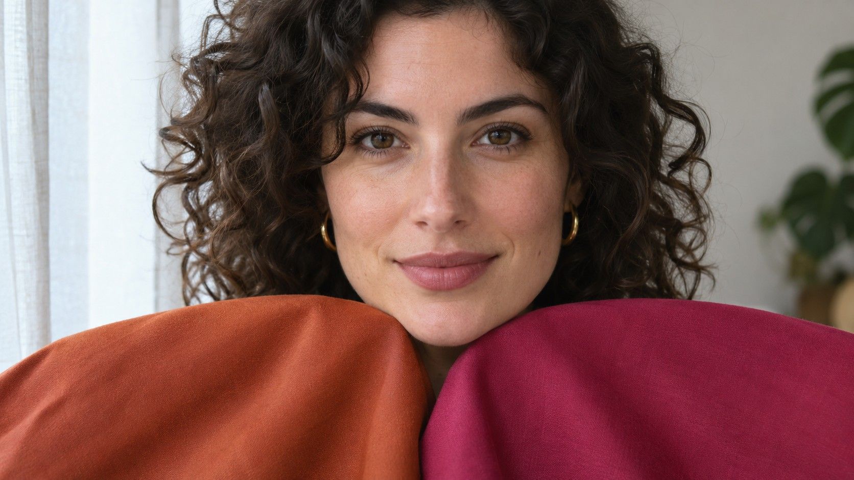
A top, scarf or jacket lapel gives a color a large part in framing your face. Test those pieces where they actually sit. A high crew neck fills much more of the area below your face than an open V-neck. A shirt worn under an open jacket may show as a stripe. Even when the fabric stays the same, the size and shape of the color can change the way you see the outfit.
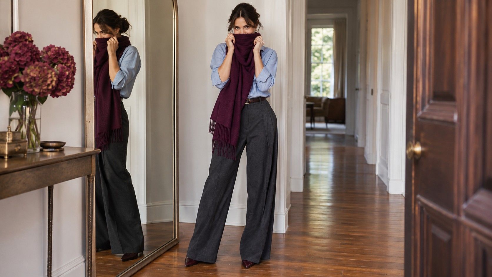
Start with a dependable top and a color you love that feels demanding as a full layer. Try the second color in a scarf, a visible underlayer or a knit with only a small amount showing. Look once from a few feet away and once from normal conversation distance. The first view picks up the largest areas of color. The closer view shows whether the amount near your face is pleasant.
A favorite color that pulls too much attention close to your face can still play a strong role in your clothes. Try it as a skirt with a plain top or as a shoe that repeats a color in your bag. Keep the near-face part of the outfit unchanged for the first comparison so you can decide whether the new color makes the whole outfit easier to enjoy.
Start with a quiet base that can carry several accents
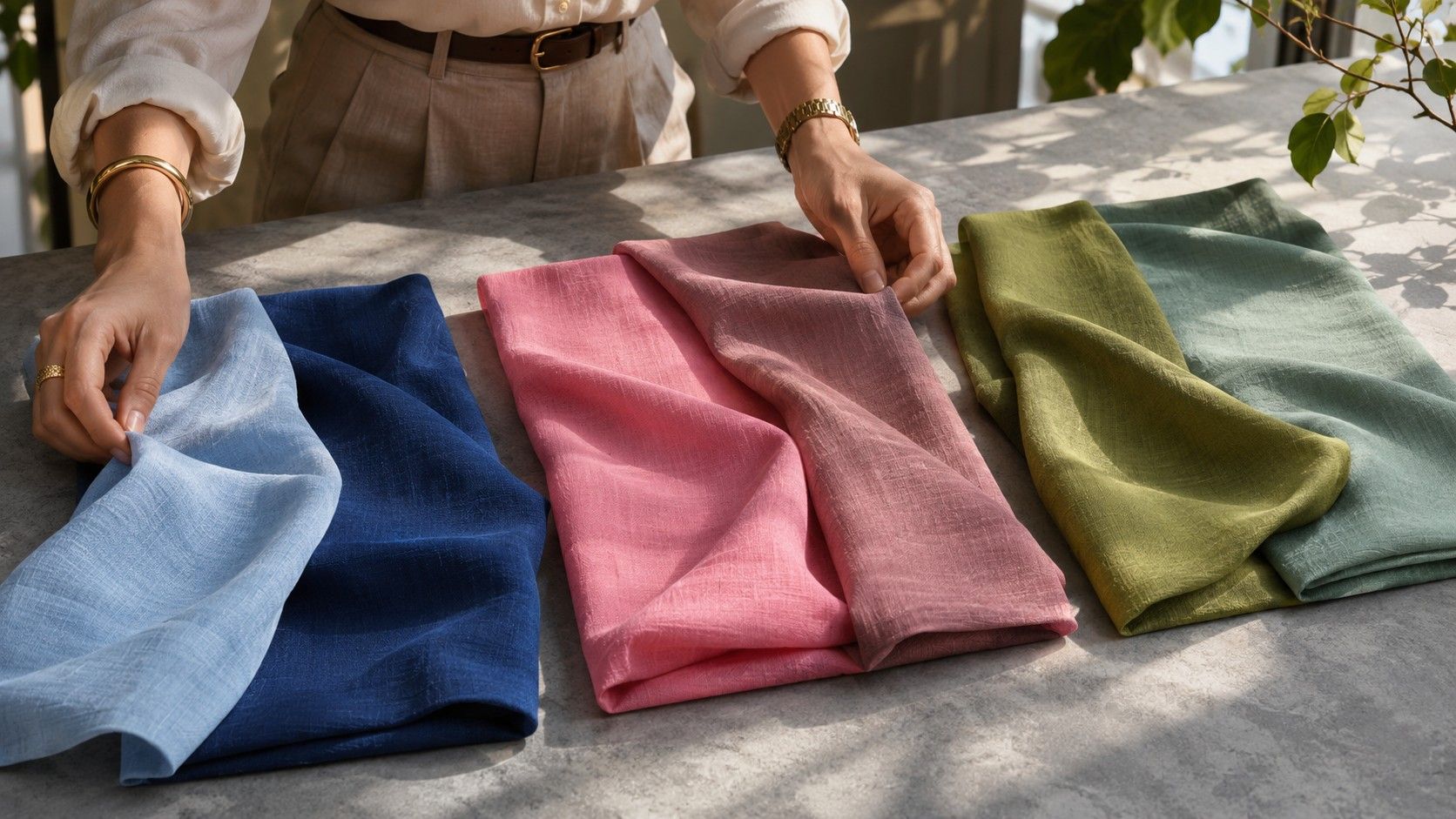
Take two bottoms you wear often and one cardigan or jacket. Compare them against two or three tops you already rely on. A useful base color makes more than one outfit easy. Navy might go with faded rose, oyster and a cool green in one wardrobe. A warm brown might support cream, terracotta and a warm blue in another. Look at the specific pieces before you decide how broad your neutral group should be.
Try shoes and a bag with the outfit before writing down a reliable combination. A dark shoe beneath light trousers can create a separate accent even when people call the shoes neutral. If you would rather keep attention near the face, try a shoe closer to the trousers' depth and move the strong accent into the shirt or jacket. More than one version may work depending on how bold you want the outfit to feel.
A neutral can also be a subdued color. Soft olive trousers may behave as a neutral if several pieces go with them and you wear them on ordinary days. The same trousers are more of an accent if you need a very particular shirt and shoe for the combination to feel finished. The test is repeatability in your wardrobe.
Give the outfit one clear relationship between colors
Try repeating either a hue family or a similar depth. A slate-blue cardigan picks up a small blue thread in a striped shirt without matching it exactly. A cream sweater and light tan trousers create continuity through similar lightness even if the colors have different hues. Either strategy can help you add a less familiar color and still recognize the outfit as your own.
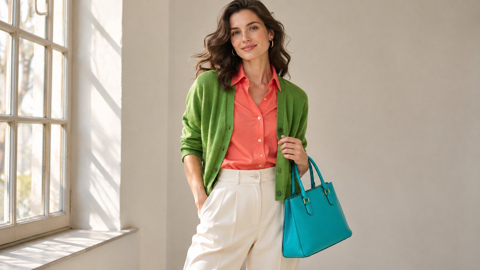
If two colors both draw attention, decide which gets the largest area. A fuchsia top and an orange jacket can be an intentional bright combination. You might prefer the same two colors as a jacket with a pink scarf edge. Put on both versions before choosing. The color names alone cannot tell you how large a role either garment plays.
A print offers several cues at once. Hold a potential companion piece beside the print and compare it with the background color first. Compare it next with a smaller color in the pattern. Echoing the background often makes a continuous layer, while echoing one of the small marks draws that color forward. If the printed fabric shifts as you move, look at the combination from far enough back that the pattern reads as it normally does.
Test a light, a medium and a dark layer
Try a light top with medium trousers, then keep the trousers and put on a darker top. Make the fabric and neckline as similar as you can. Decide whether you like a visible break or an easy transition between the two areas. Look at the face again. Some combinations look composed from across the room and a little heavy at the neckline. An open collar, light necklace or visible undershirt can handle that problem without changing the base.
Set up the same exercise with an outer layer. A bright coat may frame your face for the whole commute and spend hours on a hook while you work. The colors that suit you outdoors can have a different effect under office lamps. Find one layer arrangement you enjoy with the coat open and again with it off. This is especially important if you mostly shop while wearing a coat and only try on the new piece once you get home.
Vary the depth of a single accessory before assuming an outfit needs an additional hue. A rich brown belt can connect two warm colors or introduce a hard edge when both pieces are light. A medium-brown belt may make them look closer while keeping the same leather. The small adjustment can tell you whether the outfit needed a different color or a smaller change in value.
Save combinations you can repeat next week
Take two or three daylight reference photos of outfits you have worn and would wear again. Write a short note about the colors and placement. “Warm light top with deep pants and a small rust accent” describes a useful combination more precisely than “Autumn outfit.” You can substitute a cream shirt and brown skirt later while keeping the parts you found helpful.
Bring the notes to your next closet sort. Keep the strongest combinations visible and move pieces with unresolved colors to the bottom of the list. If you see the same problem twice, solve that specific part. Try a cooler version of the light layer or a less vivid accent before replacing everything whose color is harder to use. Every reliable combination gives you an answer that fits the clothes you wear.